| 2022.01.15 |
A couple of days ago, The Wall Street Journal ran a story about how all
three mobile networks operating in the US — AT&T, Verizon, and T-Mobile — intend
to dismantle their 3G infrastructure by the close of this year.
I considered the news for a moment, then broke into a cold sweat as I dialed
OnStar.
My car is a model year 2013. That means that later this year, my car will be 10
model years old.
I knew with near certainty the OnStar transceiver in my car operated over a 3G
network. Verizon's, in fact — based on previous conversations with OnStar.
According to the advisor I spoke with, OnStar will be marketing a device in the
coming months to allow older transceivers to continue to function in the new mobile
spectrum. I was told to watch for details in March.
I was also told these devices will "plug into" the transceivers, and that
subscribers will be billed for the cost of those devices.
I suspect the subtext of the previous paragraph is that we'll have to have the
devices professionally installed, and that subscribers are going to have to weigh
the benefit of continuing the subscription against the costs of the device and
the labor for installation. I fear this could be an expensive proposition, which
could force owners to consider upgrading their cars.
Personally, succession planning has become a more serious matter. I love my car,
and I've had very little trouble with it — so much so that I trust it for kiddo's
use far more than I would buying another used car. But now the car has reached the
point where the technology its emergency contact system relies on is being retired.
In an age where cars are more and more computerized, and less and less maintainable
by their owners, the cost of ownership is today now influenced by occasional
disruptions like this.
Link to this
Back to top
|
| 2022.01.01 |

Overall, posts were down this year. In 2020, I spent a lot of time out of work due to
COVID-19. Happily, I spent 2021 hard at work.
Posts on fitness and cycling were way up this year. COVID-19 posts remained in the top
spot, though 2021 saw only half as many such posts as did 2020.
- Art posts were up. Laurel gifted me a pair of Tarkay's and one or two Barnes this year!
- Books were down this year, which likely reflected my general exhaustion with all things
politics — particularly following the attack on Congress in early January. There were a
couple of books I wanted to buy, but never "closed the deals."
- COVID posts generally reflected the progress the United States had made against the virus
during the spring and summer months. I posted 32 times about COVID-19
during 2021, with no posts ocurring between May and July. Contrast with 63 COVID-related
posts in 2020. Posts to the topic began increasing late in the year, with the arrival of
the omicron variant.
- Posts about fitness/health shot up this year, and for good reason: I decided to finally
get my shit together and be an adult — to stop eating like a 17 year old and ignoring
my diabetes. To say 2021 was a transformational year for me is underselling it — I got
healthy in a VERY big way, dropping from about 275 lbs down to 219, and reducing my
astronic A1C measurement to 7, earning the description "well-managed."
- Gaming posts dropped signficantly over the year, too. I haven't spent much time on the XBOX
this year, except to use it to play DVD's... but I've been loving Grand Theft Auto III
on my PC.
- Geek posts were also way down in 2021.
- Movie posts were flat, though we did go see a few this year. Theaters were prety much
closed throughout 2020. Music posts were also flat, though I played a LOT of guitar
over the year.
- There were several politics and national interest posts over the year, but one of them,
recounting the aftermath of the Presidential Election, ran from Election Day through
to Inauguration Day.
- Several posts to the Texas Life topic were made in February, when the state saw a
terrible snow storm that took out power across the state and killed hundreds.
- No posts on whiskey this year, which is hardly surprising since I gave up drinking like
two years ago or more.
| Topic | Count |
|---|
| art | 1 |
| cycling | 4 |
| COVID-19 | 32 |
| family/kids | 1 |
| fitness | 9 |
| gaming | 3 |
| geek | 5 |
| nation/politics | 7* |
| texas life | 4 |
Link to this
Back to top
|
| 2021.11.25 |
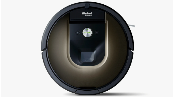
I ordered a refurbished Roomba 980 on ebay for what seemed a very reasonable price. After
setting it up this evening and running it for a while, I have to say the Roomba does not disappoint.
The unit arrived with only the charging station and an AC power cord for the charging station. No manual,
no instructions, not even a quick start guide.
Googling "iRobot Roomba 980" quickly returned a manual. Following its instructions, I set up the charging
station and docked the vacuum on it to allow it to charge. A short while later, I downloaded the iRobot Home
app to my iPhone, and followed its instructions on configuring the Roomba for our home network... took maybe
three minutes.
I set a schedule for the machine to run this evening. Right on cue, it sprang to life and started its task.
After running for an hour, it had swept up the kitchen several times and did a fair amount of the living room
and adjoining hallways. It navigated the carpeted areas with no problem at all.
In a house with more pets than people, the vacuum collected a very impressive amount of pet hair — partly,
I suppose, because it moves unhindered beneath furniture I'm too lazy to move when I run the manual machine.
(Look, I'm just being honest here.)
In the hour it ran, it consumed probably 80% of its battery — but much of the terrain was living room carpet.
In practice, I'd probably maybe limit it to running for 15 minutes or a half-hour at a time instead of it just
running open-ended like that.
Here's the most impressive part (to me, anyway): Each time the robot runs, it builds a map of the area.
After the initial run of 15 minutes, it had a lot of the hard surfaces figured out — the back entrance and
the kitchen area chiefly. I mean, it was sort of rough, but you could make it out. After the hour, it had
added significant detail to the map: one can now clearly see the kitchen, bar, dining area, much of the living
room, and the halls. It had mapped its position well enough that when I pressed the "home" button (which I
thought would send it to its dock), it went STRAIGHT there, navigating the curvature of the walls and everything.
About the only negative I could say — and I feel a little dumb for saying it — is that the machine sounds
like a vacuum cleaner. It's not quiet. It's every bit as loud as my Dyson vacuum or a hair dryer. Tonight for the
hour it ran, I ended up "sending it home" because I'd had enough of the noise. I guess I thought it'd be quieter.
Everything else about the machine so far is super impressive. The amount of junk it collected was astounding.
Would I buy another? Today, I absolutely would.
UPDATE
One month on, and I just about can't love this thing any more than I do. It amazes me how much fur and
dust and whatnot it collects.
I had a bit of a headscratcher last week... no matter what I tried, I couldn't get the bin warning to
reset. Fortunately, the Internet came to the rescue. I learned two things from this person's blog post:
(1) There are sensors inside of the bin compartment that work like obstacle sensors do on garage doors.
If the sensors can't "see" each other, the machine interprets as if the bin is full. (2) I had been
clearing the bin by sticking my fingers in its "mouth" and removing the filter from the top, then working
the contents out into the garbage. It turns out the entire "mouth" side is hinged. If you look at the
bin from the top, the side where the mouth is is black and has a pair of yellow triangles that appear as
subtle arrows to suggest how to re-insert the bin. If you press at where those arrows are, you can open
the bin, giving much easier access to its contents. The sensors I mentioned earlier are two rectangular
shapes that jut out on either side of the mouth. Cleaning those may resolve a difficult bin error issue.
I would still buy one again in a heartbeat.
I also purchased a pair of virtual wall units — also from eBay, and far below retail price — and these
things are awesome. The images suggest they're about the size of an electric coffee grinder, but they're
actually much, much smaller... more the height of a coffee cup. Each runs on a pair of AA batteries
(included). I use them to confine the Roomba to our living room — one as a boundary on the north side of
the room to prevent access to the kitchen, and one on the east side of the room to prevent access to the
main hall. I do actually need a third, though, to be completely effective for the family room area.
With all the amazing work the Roomba does, though, — at least, around my house, with four cats and a
dog — I think it's already time to do some maintenance. I think I probably should have changed the HEPA
filter a couple of weeks ago, and the brush bristles are looking pretty dark. Amazon.com seems to have
no shortage of replacement parts available for purchase.
In summary, for a home that has pets, and carpet throughout, I'd recommend buying a refurbished unit
straight from the manufacturer via eBay, and buying a maintenance kit with replacement brushes
and air filters. When run regularly, the Roomba will capture tons and tons of debris at first — you'll be
emptying the bin often. If you didn't vacuum your floors often before getting the Roomba, you may find the
filter and/or brush could use replacement in that first month. Over time, you'll find there's less debris
for Roomba to collect, and you'll be emptying the bin less often.
Link to this
Back to top
|
| 2021.06.27 |

Over the last several months, there's been much ado about Apple's new ATT feature in iOS 14.
ATT is what the cool kids call the defensive capability built into the iPhone's operating system
that prevents apps from tracking your identity outside of Apple's "walled garden" without your
expressed permission. Many postulated
the new privacy move by Apple would kill especially Facebook's data collection efforts, which
constitute a very large revenue stream for the social media platform. I've read several articles
which exposed the breadth of data Facebook collects through its iPhone app — it's monstrous and
unreasonable. Data collection of this magnitude, combined with weak protections, is what allowed
a small company called Cambridge Analytica to weaponize Facebook for political purposes. With
ATT now requiring each unit's owner to specifically authorize Facebook to collect their data,
Apple, combined with user preference, have all but closed the data floodgates to Facebook entirely;
the last reporting I saw suggested between 5% and 10% of Facebook users have given the permission
now required for Facebook to collect data from their iPhones.
I have been using Facebook less and less of late, mostly as a function of the divisiveness
and rancor that didn't entirely cease at the close of the most recent federal election cycle.
But today, things in my native Facebook app were different: ads. About every third item in my feed
was a fucking advertisement. This was pollution of a sort I'd never seen before, because they
didn't seem to be driven by my preferences or history. It's just ad after ad after ad of random
shit.
As I'd been reading about what a data Hoover the Facebook app is, I've weighed the price of
using the app with the experience using a browser. I chose Firefox for an experiment, making
Facebook the only page I used that browser for, so every time I'd open it, it'd open to Facebook.
I found the browser-based experience not entirely distasteful. There was a lot about it that
very closely approximated the experience through Facebook's app.
So today when I found all those ads cluttering my feed, I switched to Firefox and found...
no ads. Anywhere. My feed was all content, no ads. I checked the app again — the SECOND item
on my feed was an ad.
I looked closer at the settings on Firefox Mobile. What? A night mode? YES PLEASE! Once I
found that setting, there was no reason for me to use the Facebook app any longer. It's outta
here!
I'm not a hard-core privacy guy, but I do consider my information as currency where "free"
apps like Google and Facebook are concerned. Put simply, if you're going to use their apps,
you have to be okay with them monetizing your metadata. So be a smart shopper, and vote with
your data. Personally, I'm not okay with the quantities of data Facebook and Google collect
from my phone, so I choose not to use their applications.
So my preferred substitution for the Facebook App is accessing their site via browser.
Firefox Mobile, built by Mozilla, is known for being pro-privacy, and it's new "night mode"
sealed the deal for me.
Link to this
Back to top
|
| 2021.04.29 |

This advice is not mine — it's from Mozilla Support — I'm just passing their information along.
This particular issue has affected me for months — I even went so far as to install a browser
sizer widget to try to work around it: My Firefox browser software would always open full screen —
not necessarily maximized, but... it sort of reminded me of JavaScript used back in the 1990's to
expand the browser to full screen. It didn't matter what I did to try to stop it.
This morning I guess I found the right combination of search terms to Google my way to the
aforementioned support article. The problem I was having can be traced to a corrupted XML file.
The solution, provided by Fred McD, suggested spelunking your AppData folder down to Firefox/
Profiles to find and delete xulstore.json. I found that file in a folder one level below — a lot
can happen in software over a year (Fred McD provided the solution in April, 2020).
Sure enough, once I deleted the file I was able to open Firefox, resize it, close it, and reopen
it at the size I'd previously set.
Thank you, Fred McD and Mozilla!
Link to this
Back to top
|
| 2021.01.15 |
I don't like ads on anything other than broadcast TV, and that's only because
I grew up with them. If I'm frequenting a website that's ad-supported, I'll typically
purchase a subscription — I'd rather support them directly than deal with annoying
ads. But where I really draw the line is seeing ads on a service I'm already paying
for.
Apple has crossed that line by pushing notifications to my Apple Watch about its
programming. I don't GAF about a new show on Discovery+; grabbing my wrist to
tell me about it is not only unhelpful, but it's motivation for me to tell others
how to configure their settings so you don't annoy them, either.
I am running the latest versions of the iPhone and Apple Watch operating systems,
and I've never messed with any of these settings before — so I assume I'm about to
walk you through changes to default settings.
I started with the Apple Watch app, because that app typically controls settings
for your Apple Watch.
- First, I touched the Notifications menu. Make sure you're looking at the My
Watch panel (I think it's the default when you open the app).
- Under Notifications, you'll see three switches that take up the entire screen.
Scroll down to see notifications settings for individual apps... you won't find
AppleTV there.
- Scroll down further until you see "MIRROR IPHONE ALERTS FROM:" — and keep
scrolling until you find the AppleTV app, just called "TV". You'll find its set to
OFF. Switch it ON.
Now, move to your iPhone Settings app.
- Touch the AppleTV menu (the text reads, "TV").
- Scroll down to "ALLOW TV TO ACCESS," and touch the Notifications menu.
- Set Allow Notifications to OFF.
Once you've completed that last step, if you look back in your Apple Watch Settings
app, AppleTV is not listed in the "MIRROR IPHONE ALERTS FROM" list.
Hopefully, this will end the ads on my Watch. And yours.
Link to this
Back to top
|
| 2021.01.03 |

It's not difficult to imagine that posts about COVID-19 were far and away more plentiful
than any other topic in 2020 — there were so many that I split the content into separate
records by month to try to better manage them.
After COVID-19 posts, gaming, national interest, and nerd posts took top spots in the
interests topics this year. In 2019, nerd posts took the top spot, and posts in the national
interest topic were only half of what they were in 2020.
| Topic | Count |
|---|
| books | 4 |
| car | 2 |
| cooking/food | 3 |
| COVID-19 | 63 |
| family/kids | 6 |
| fitness | 0 |
| gaming | 14 |
| geek | 13 |
| leadership | 0 |
| movies | 0 |
| music | 9 |
| nation/politics | 12 |
| texas life | 1 |
| whiskey | 1 |
I think my totals for the year sort of reflect life during
the pandemic: music posts are way up (bought a new guitar and have been playing it A LOT);
I read a few books this year; my gaming posts are through the roof (I really got into playing
retro games like DOOM and QUAKE on my Windows 10 laptop), and I made no movies posts. Much
of our world was closed this year — including, and especially, movie theaters — and so
at-home activities took the spotlight.
Also telling, my food/cooking posts increased, and my whiskey posts decreased: I was
cooking more for my family, and I pretty much cut out drinking. Kiddo had a really rough
year, and I wanted to show her that she could depend on me to be available to her whenever
she may need. Mixed drinks don't fit too well with that goal.
There's one place where I sold myself a little short: I should have made a post in the
fitness topic about the swimming I was doing starting in August. In short, I figured out
a sort of a swimming routine I could do in our backyard pool, and after doing it for about
a month I really started seeing some changes in my physique; others noticed it, too. So
I can't wait to get back in the pool in a couple of months — I figure if I could look and
feel good in the couple of months I was swimming this way, imagine how I'll look and feel
after doing it for an entire season! It's actually emblematic of the pandemic, though —
the truth is I don't know what I would have done had we not had the pool. I was in it
every day I could this past year: being in the pool (in the sun) charges up the vitamin D,
which had been said to have a huge impact on how the disease affects a person.
Link to this
Back to top
|
| 2020.12.08 |
Perhaps this is a function of aging, but I guess I expect a relationship to
exist between the expense of an item and its quality — or, closer to the matter,
its longevity.
We recently replaced my Dyson upright "Ball" vacuum cleaner. It was an "animal"
model, meaning — well, implying — it was a superior machine to the manufacturer's
normal models. I paid somewhere around $570 for it new in about 2009. (By the way,
I *think* Dyson announced sometime in 2019 or 2020 that it wouldn't produce its
upright "Ball" vacuums any longer, preferring to focus on its "stick" models instead
— perhaps as a function of demand; yet Dyson is currently selling two upright
"Ball" models.)
Sometime in the past few years, it hasn't sounded the same as it had. To be
honest, I believe the change in sound happened at the same time we let someone
borrow it. I'm not saying that to be a jerk or anything — it's an observation,
not an accusation. (Full disclosure: it's totally passive-aggressive accusation.)
Anyway, the bottom line is that my wife spoke to me about replacing it, and I
was disgusted, I guess. Disgusted because I recall clearly how expensive it was
when I bought it. How could this need to be replaced? Her calm response: "Well,
it IS ten years old."
— and that's when my world started to crack.
My mind became overloaded with questions: "Has it really been that
long?" Just considering that much produced a memory leak. I could feel
letters and words falling from my brain and down my body as I tried to compare
my memories and my expectations to reality.
I mean, yes of course I expected the unit to be a high-quality machine, but
I guess I never really translated that expectation into time. How much
time should I have expected it to operate? Is 10 years really
too little? How much more should I reasonably have expected?
I don't have answers, because I never made an estimate. I was just stunned
that I had to replace it at all. And that was maybe naive of
me at best.
It just didn't occur to me to time-box the transaction. To think, "Well,
we'll probably get 10 years of service from it" — you're not going to find
that printed on the box or in the marketing materials. You'll perhaps find a
warranty on what they present as a minimum time expectancy on various
parts or maybe the entire machine. A lower bound, not an upper bound. Perhaps
that's the value of Consumer Reports (not a sponsor).
A more pragmatic approach might have been to start with the assumption —
mindfully, I might add — that companies understand that they can't build
widgets so well as to preclude repeat business. Most of the time, obsolescence
is built-in simply as a function of the life expectancy of the materials or
as a function of use — meaning, at some point some dipshit is going to use
the machine in an unintended way. Public means public. I think consumers
inherently understand this, but perhaps don't approach home appliance
purchases with this in mind — I just think it's not a consumer behavior.
My actual approach was more simplistic than the ideal: "This vacuum was
very expensive, so I expect it to perform well indefinitely," I guess.
Laurel mentioning that ten years had passed put a gaping hole in that thought.
Ten years is not indefinitely, but, I mean... it's ten years, and that's a
lot of years, right? The time it takes for your infant to hit double-digits
is a long time, though it seems to pass in the blink of an eye.
Can I be happy with a ten-year lifespan? It's hard to resist doing the
math: I spent $57 on that vacuum cleaner each year I owned it, whether it
got used or not... $5 each month.
At $5 per month, did I get a good deal? Harder to answer. One the
one hand, you could think, "I get to use this all I want for a month for only
$5? Such a deal!" — but that's backwards of what the situation actually was.
If I used it once each week, then it was like I spent $1.25 each time I ran it.
If I used it every other week, the cost doubled. If I average the two, then it
was like I spent $1.87 each time I ran it. Does it seem like such a deal now?
Now I feel like running the vacuum so I won't feel like I've wasted money.
Which is not where I'd hoped this post would end up.
I guess it's easier to think about life expectancies when you're talking
about consumer goods that one expects to have a relatively short
life span. I was just inspecting a plastic food container I'd just removed
from the dishwasher. The cool thing about this container is that it
contracts to minimize storage space thanks to an accordion-like folding body.
As I was looking it over — and I'd just been writing most of this post —
it occurred to me that I've owned that container for probably longer than I
had the vacuum cleaner. And I had no expection the food container would be
around this long. Why? Maybe because it was about a $10 purchase.
Thinking about it now, I guess I would have expected to get maybe two to
three years of service from that food container. If I'd been asked if I could
expect over ten years of service from the thing, I probably would have replied
that that'd be nice, but I wouldn't have expected it. Had I been asked the
exact same question about the vacuum cleaner, I might have replied that I felt
it should last me ten years, based on its features and expense.
Link to this
Back to top
|
| 2020.10.31 |
On Halloween in the year of the COVID-19 Pandemic, I found a real treat: My iPhone
12 Pro arrived today.
Naturally I thought I'd share a few words about it.
First and foremost, it is the most expensive mobile technology I have ever
owned. I bought it because the glass seems to be coming out of my iPhone X,
and Apple stopped selling the iPhone 11 the moment they introduced the 12. Ever
since Apple introduced a way to affordably buy the units directly from the company
instead of through the carrier (p.s. — AppleCare was a way better deal than was
the insurance AT&T was offering), we've not looked back.
FWIW, I used to be an Android guy, primarily because I could create on that
platform in ways I knew Apple would never allow. But I'm an Apple guy now mainly
because of my investment in content — movies and music — and because the Apple
Watch is indispensable in my life now (so much so that I've not bought the Rolex
I've lusted after for years because I know I'd never wear it).
Oh, and one more thing — to underscore what I mentioned above, I didn't bother
to upgrade to the 11 — so some of the things I'll mention in the following paragraphs
may also have been featured on the iPhone 11/11 Pro. I've zero experience with that
model, nor its novel features.
Disclaimers and whatnot out of the way, I have to say the iPhone 12 Pro is
the prettiest hardware Apple has produced — especially in "Pacific Blue."
Unboxing
The phone's box resembles a VHS cassette: the black box (BLACK — not white!) is
about the same height as one, because Apple infamously declined to include a 5W USB
power adapter with the phone, claiming, when they announced the phone, that they're
simply "thinking of the earth."
I call bullshit, Apple. You're trying to hide the fact that a 5W power
adapter won't push enough juice to your new product line.
USB-C
I offer as evidence the cable they DID include with the phone. It is NOT the
Lightning to USB cable they used to include — it is a Lightning to USB-C cable.
USB-C is a technology that's been around only a few years — if you're like me,
you replace your computers every 3 to 5 years. I *just* got my first laptop with
USB-C almost a year ago.
You may think of the included cable as a nice accessory if you're USB-C enabled,
but I'm betting most of us aren't there yet. Apple has a history of pushing progress
on its customers — recall the iPhone 8 and X were the first units to ship sans
headphone jacks. Apple including a USB-C cable should be viewed as another shot
across the bow: Apple is about to make the standard 5W Lightning to USB power adapter
a thing of the past.
(Check out the iPhone accessories Apple currently has for
sale at https://www.apple.com/shop/iphone/iphone-accessories/power-cables.
Using the site's default sort (by "Featured"), you'll find a 20W USB-C power adapter
on page 1 for $19; the standard, 5W USB Power adapter is still available (also for $19)
and may be found near the bottom of page 3.)
Charging
Also, take careful note of the wattage difference between the two chargers... I suspect Apple knew
the standard 5W power adapter wouldn't cut it: Apple published this in their specs for the
iPhone 12 and 12 Pro:
Power and Battery
Both models:
Built‑in rechargeable lithium‑ion battery
MagSafe wireless charging up to 15W
Qi wireless charging up to 7.5W
Charging via USB to computer system or power adapter
Fast-charge capable:
Up to 50% charge in around 30 minutes with 20W adapter or higher (sold separately)
MagSafe
Wireless charging up to 15W
MagSafe charging is twice as fast as Qi (because it can push 15W compared to 7.5W), and, if
you can "fast-charge" 50% of the battery in 30 minutes using the 20W adapter, it'll take about
2 hours to charge 50% of the battery using a standard 5W adapter — meaning charging the phone
100% using a 5W USB adapter would take about 4 hours.
FOUR HOURS.
You've already spent $1300 on the phone and a USB-C cable you didn't really even want.
Apple knew damn well
its customers wouldn't stand for spending a half day waiting for their phone to charge, so
it slyly included a USB-C cable and left out the 5W adapter to force customers to spend at
least another $20 on a 20W USB-C power adapter, OR go all-in on MagSafe charging accessories
(Apple isn't selling any cases for the iPhone 12 line that aren't MagSafe — prices start at
$49).
This was never about the environment or the saturation of their 5W power adapters; it was
about pushing people to more efficient charging solutions to hide the fact that the old
adapters won't sufficiently charge these devices.
There was a lot of talk about wattage above. At a point, the wattage being pushed into
your battery will create a noticeable byproduct of heat. I know that my older iPhones never really
felt warm when charged using the 5W adapter, but I'd imagine that 20W USB-C adapter could
make your new 12 feel warm — I don't know, because I don't have a 20W adapter. Apple's
specs show that 20W is the max the iPhone 12 and 12 Pro will tolerate. As a reminder,
MagSafe will charge at a max rate of 15W, and Qi charges at half of that.
WIRED, in an article titled "Why It Matters Which
Charger You Use for Your Phone," reported that "Apple itself has gone on the
record as saying the official MagSafe Charger is capable of interfering with the
magnetic strips and chips inside credit cards, security badges, passports and key
fobs, and that it might leave imprints on leather cases." (I experienced similar behavior
from my EarPod charging case a couple of years ago — I kept having to get my hotel
card key recoded until I figured out what the culprit was.) Apple is marketing a leather
pocket that attaches to the phone using that MagSafe ring. If you bought one of these
and are using a MagSafe charger, make sure you take that pocket off before charging.
Also included in the box is a poker thingie to be used to open the physical SIM
slot, the customary Apple logo decal, and the instruction booklet nobody reads
anyway — this edition must be targeting younger people, because this print is
smaller than the fine print on medication packaging.
Phone Setup
Among the operating system improvements are newer and better ways to set up
the phone. Along these lines, the iPhone 12 Pro and iOS 14 do NOT disappoint. It
was basically as easy as holding the new handset over the old one for a moment
to collect some initial data, then choosing whether to load the new phone via iCloud
download or via BlueTooth connection between the two handsets. I chose the latter,
and the process was complete within about a half hour. (I suspect your mileage may vary,
depending on how much data is on your old phone.)
Even switching my Apple Watch to the new phone was easy peazy — as easy as clicking
"Yes" on a prompt on the new handset.
Network Setup
This year, I did something completely new — I set up a new line with my
cellular carrier and assigned a new telephone number to my new handset.
Setup through AT&T was about as easy as setting up the iPhone itself. I
visited the AT&T website, chose the option to add a new line, and followed
the instructions. The process included a form for typing in the handset's
IMEI and ICCID, though once I typed in the IMEI the form filled in the ICCID
and correctly identified the handset model.
As for a telephone number assignment, the process
only allowed me to select from a list of area codes applicable to where I
live, and the system assigned me an available number on that basis. I was
disappointed by that, because AT&T will allow you to change your number
and show you a list of about 120 or so to choose from. Why couldn't that
be part of the process?
Perhaps one might have better luck if they called their carrier's customer
service number and dealt with a person instead of an automated process. In
my case, once I completed the process, the system emailed me a "receipt"
which included my new phone number. The line was activated and number was
working within about ten minutes.
Now, the truly magical part about adding a line and assigning it to my
iPhone 12 is that the handset does not have a physical SIM card. AT&T was
able to run it using a virtual SIM as part of the line purchase process.
I don't know if previous iPhone models also have this capability. I will
be calling AT&T about whether I can drop the card from the old phone into
the new one (so maybe they can write the virtual SIM goop to it).
I've spent a few cycles thinking about the effort involved in switching
my number. A big part of that effort is poring over every website and
every application that I use two-factor authentication (2FA) on and changing
my telephone number on each. It's a big undertaking, and one I'm sure most
forget about. I started a spreadsheet a few weeks ago to try to track all
such sites and applications.
Now that I've explained that effort, I can tell you that I learned I
can change my assigned number to one from AT&T list after I've had this
number for 30 days (a billing cycle). Today, I still like the
notion of a "vanity" number, but I do not want to go through this whole
2FA/notify friends/notify businesses thing again. So I'll probably stick with
what I've been assigned.
More about 2FA
2FA generally works like this: You attempt to log into a system — say,
Microsoft.com — and after you successfully pass an initial authentication
using a user ID and a password, a text is sent to your phone or an email is
sent to your address. In both cases, the message contains a code that the
system expects you to type in. If the two match, you have successfully
authenticated yourself to the system. The first authentication measure is
based on something you know (your ID and password) — the
second is based on something you have (your phone or your
email credentials). "Something you know" and the "something you have" are two
factors used in authentication — this is actually two-factor authentication.
(I would argue that a second authentication measure of texting your phone
is truer to the "something you have" method, because your phone is a physical
device; I'd place email account credentials into the "something you know"
factor.)
The catch with 2FA is the "something you have" part — particularly if
the system is sending authentication messages to your mobile phone and you're
changing your mobile phone number — because you have to authenticate to the
old number before you can change the system to use your new number.
It's a "catch-22": if you change your phone number on your handset (using
the aforementioned list), the change is immediate. There's no "grace period"
that will allow you to spend some time switching from one number to the other.
Once that number is changed, you're locked out of whatever 2FA system you have
because the authentication texts are going to a number that you don't have
anymore. Your most likely alternative is to call customer support for each
of your 2FA-enabled systems and hope a representative can make the change for
you and stay on the line while you attempt authentication.
For what it's worth, here's how I approached it:
I made a list of
all of the systems I could think of that uses 2FA or communicates with me
using my mobile number. My list included Apple, Google, Facebook, LinkedIn,
Microsoft, Mozilla, my bank, and my home security company. Next, I
went through each of the companies on my list and found the URLs I'd need
when it came time. Here are a few common ones one might need:
| System | URL |
|---|
| Apple | https://appleid.apple.com/account/manage |
| Google | https://myaccount.google.com/phone?gar=1 |
| Facebook | https://www.facebook.com/settings?tab=security |
| LinkedIn | https://www.linkedin.com/psettings/sign-in-and-security |
| Microsoft | https://account.microsoft.com/profile/contact-info |
Happily, some good folks made a pretty inclusive list for us. Visit
https://twofactorauth.org/
for their categorized list.When my new phone arrived, I visited my carrier
and bought the new line as described above. Once the line was active, it was time
to work my 2FA list. To make the changes to each 2FA-enabled system, I needed
both phones — the old one to receive the 2FA codes sent by each system when I started
making changes, and the new one to test apps (for example, my bank has an iPhone app)
to ensure I could authenticate using the new phone number. Keep that list
handy — I added a few others as life happened over the next couple of days; places like
ACE Hardware and the local grocery store, with memberships that identify you by your
mobile number. Next, I went through Facebook and identified all of my friends
who probably have my old number — I need to contact them with the new one. iOS has a
feature that allows the phone owner to block calls that aren't in their address book —
so if I'm texting or calling them, I know I'll have more success if I use the old phone.
Of course, Facebook Messenger is also an option, but with all the news we saw in the past
few years about Facebook giving away users' data for "researchers," I'd rather text from
my phone if I can.
-
Because I'm trading in my old phone for a discount on the new one, the time I have
to spend on this 2FA business is limited — I think Apple requires the old handset
to be sent in within 10 days. Once the old handset is sent in, I'll contact
my carrier again and delete the line it used.
Pacific Blue
I was afraid the color would be too gray for me to enjoy. I actually planned
to buy a case to hide the phone's body in prep for not liking it. I have a history
with grayish blue — products made with it, like clothing and cars, seem attractive at the
start, but then I burn out on the color quickly and end up hating it. It's the only color
that has affected me this way. Holding the iPhone 12 pro in my hand,
I do not perceive "Pacific Blue" as a grayish blue; the color seems to have more of a
metallic, steely quality that seems infused with a lighter shade of blue. Together,
it's certainly more blue than gray, and much more interesting than the "space gray"
I've preferred for years.
Historically, Apple has varied its devices' boot screens based on their color. Typically,
lighter colored devices (like silver and gold) use a white boot screen with a black
Apple logo; darker colored devices (this is why I keep choosing space gray) use a black
boot screen with a white Apple logo, which is FAR easier on the eyes, in my opinion.
(In my case, not just easier on the eyes: it avoids headaches.) So one of the questions
I had in selecting the Pacific Blue model was about the color of the boot screen. I am
happy to report the boot screen is black with a white Apple logo.
The Camera
I may have mentioned in a previous post that the reason I decided to go with the Pro
model of the iPhone 12 is because I wanted a small upgrade to the camera subsystem.
I know that the term "f-stop" is a thing, but I don't know what it means. I don't need
top-of-the-line because I can't understand top-of-the-line. But what I do understand is
the majority of the photos I take generally involve zoom. The camera app on the iPhone 12
Pro has on-screen settings for 0.5x, 1.0x, and 2.0x zoom. And in portrait mode, there are
two new lighting settings for mono images.
But to me, the most eye-popping improvement in the iPhone camera/software is in its
treatment of low-light subjects. The other night, I took a photo of a directly-lit subject
in a darkened room, and I was amazed at how much the camera detected — it was a bit like
full-color night vision. Looking at that photo now, it's a bit hard to believe that room
was dark when the photo was taken.
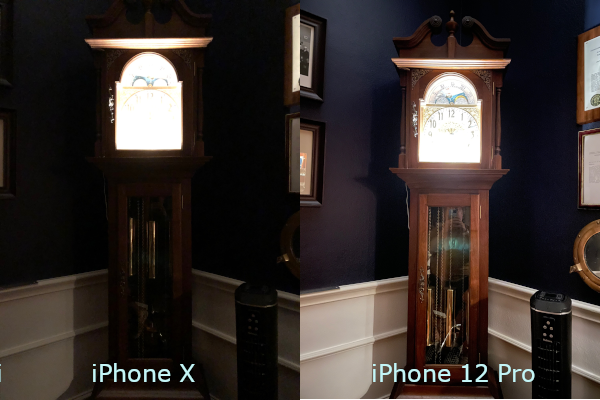
Everything I've said above likely in no way does justice to the advancements Apple has
made in mobile photography. I mean, the tech specs for the camera reads a bit like movie credits.
Conclusion
So far, I love this phone, but emotionally I'm in a tug-of-war with my brain over its
finish. On the one hand, the Pacific Blue is so lovely that I don't want to hide it
beneath a case; on the other, I know I have to protect this beautiful shiny machine. I've
been carrying it gingerly for the past two days while awaiting the arrival of a case from
Amazon ($13, not $50).
Setting up the phone — including adding a new line through my carrier — was a breeze.
I was stunned at how fast I was able to do both.
Working through my 2FA checklist went really quickly, too — doing my homework up-front
seemed to pay huge dividends. Two days in, and I've made changes to all the accounts I've
thought of, and sent texts with the new number to family and to friends. The key is this:
if you're going to change your phone number for your new phone, buy a new line and assign
it to the new phone so you can still work with your old number until you don't need it
anymore — or until you have to surrender your old handset, which is my case.
Charging it on my current Qi charger is a little rocky. I'm not certain, but I suspect
that once I get a case on the phone, it'll lay flat against my nightstand charger. I think
the raised camera lenses are preventing the phone from having good contact. The great thing
is that once it's charged, it sure seems to keep it — the battery doesn't seem to drain
quickly at all, which may only mean that I'm simply not using power-hungry apps.
Link to this
Back to top
|
| 2020.10.13 |

Apple is holding an event to announce the new iPhone 12 today.
Not pictured in the artwork above are the words "Hi, Speed.", which intimates
the new model's ability to connect to new 5G cellular networks — the speed being
in the network, as opposed to the actual handset.
But I've been looking forward to the 12 for some time now, and I've seen mixed
reports about it — a year ago everybody was saying that the 11 was the model to
skip, because the 12 was going to be amazing. But rumor-chasing pundits don't
strike me as super enthusiastic about the 12 anymore. I even saw one review that
suggested skipping the 12 and waiting for the next model instead.
Personally, I love my iPhone X. Something about it that I do NOT want to give
up is that I can actually hold this phone without a case on it. Some materials
that were used in previous versions made it nearly impossible for me to grip the
phone without a case. My iPhone 7 comes to mind. The X was the first to solve that
problem, and I loved Apple for it.
My iPhone X has a 256GB memory capacity. Thanks to services like Apple Music,
I can stream my music to my phone over my WiFi instead of having to download it
all onto the handset. Plus, just like on a computer, the more hard drive space
you have, the better the unit will perform. So I'll require at least a 256GB
capacity from my next handset.
Other than that, I really don't have any other requirements. I've LOVED my X.
I've had it for two years, and it's been great. Just this morning, I found that
the glass on the face of the handset has warped and pushed outward. Not noticeable
visually or functionally, but very noticeable when holding it in your hand and
running your finger along the side (sans case). Since it's a two-year old unit,
it's WAY out of warranty — this seriously puts me in the market for a new handset.
I think I could actually be happy with the iPhone 11 Pro or Pro Max. The
marketing materials claim it had a huge jump in battery life. Yes, the camera
stuff is amazing, but it's not like I'm a professional photographer with a deep
appreciation for all of those advances — but there's a problem: Apple appears
to no longer sell the Pro models of the iPhone 11.
So... iPhone 12 Pro it is! I'm going for the Pro model because I find the
idea of a 4x digital zoom pretty appealing — among all of the goodies
the Apple photography wonks showed off today, the digital zoom is all I know
I care about right now — and I use those words specifically because it's
possible once I have it I'll find all kinds of wonderful things I never knew
I couldn't live without. I think a 256GB model will fit the
bill nicely. I'll also order it in blue, because it's a departure from space
gray, but also because there's a chance I'll enjoy the color. If I get sick
of it, there's no shortage of cases one can buy.
Link to this
Back to top
|
| 2020.07.22 |

A couple of months ago, my wife learned that D Magazine — a magazine promoting
the City of Dallas — was having contest to determine the cutest pet.
The rules were simple enough: voting was open to the public, and the public was
encouraged to vote as often as it wanted for the pets in the contest. That is, there
was no limitation on voting, and voting was as easy as clicking a button.
So I wondered, given these rules, if I could develop software that would do the
voting for us: something I could run that would visit the link that was the
destination of the button click, but do it in a way that wouldn't create problems
for other users — no denial of service or anything like that. Something that could
run inside of a loop and just click, but would also look like a browser to the server,
so the server would have data available to collect.
Over time, the project grew more and more mature. It really wasn't about my dog
at all — it was about learning something new, and adding more features as I learned
more about developing in Windows Forms: I wanted this to be a desktop application,
something outside of my comfort zone. And honestly, I hadn't built anything in
Windows Forms since maybe just after high school.
As the project matured, I thought a lot about the pace at which the application
operated. I decided to introduce a slow mode to really pump the brakes and run at
a pace of one click per minute over several hours. Steady clicks at a rate that
should not interfere with any other traffic. Slow and steady would win the race
for us — slow enough, in fact, that I even "wired in" sounds so I could run the
software minimized and hear a short beep each time a click was performed.
I also had the software output to a text file as an option, so one could see
the incoming status messages from the server. Shorter runs produced shorter logs.
One big breakthrough was in learning how to create menus. It made the app look
so much nicer than the simple tabbed interface I'd originally used.
 I found that 8-hour runs of 500 clicks at 1 per minute was the sweet spot.
I probably went a little over the top near the end of development, when I added
web services. Two calls: one to report the parameters at instantiation, and another
made intermittently to update the current click count. Using the web services, I
could monitor the run without having to visit my computer; I could do it right from
a browser on my mobile device. The first here: implementing web services on a
desktop app.
This was never about the contest. My dog isn't really very cute. I don't care
about having a professional photoshoot. He's a little pizza-stealing asshole who
glues himself to me whenever it rains. He's not pretty. But we do love him, and
he loves us so much. No, our good boi is simply a beneficiary of the development
— development simply done to satisfy my curiosity.
(Even if it was about the contest, there was nothing stopping the other 999
participants from building their own click machines too.)
The contest has two parts: the popular vote and the judging. How are we doing?
well...
 He made it into the top 20!
D Magazine notified us today that pup is a finalist, and their art department
made us the faux magazine cover. For me, this is enough. Really. If there
were no judges involved, and the prize was awarded solely on the popular vote, I
would explain things and insist the prize go to the next popular pet. I wouldn't
feel right about that. But because there are judges, that tells me there's more
afoot here than just clicks. (Besides, I feel pretty comfortable that he's not
the cutest in Dallas. I mean, look at him.)
UPDATE:
I'm thrilled to report that we didn't win!!!
Our good boi placed in the top 20, and that was pretty amazing, I think. I'm really
glad we didn't win, though, because I think I would have felt awful had we won
based largely on a program I wrote. It wouldn't sit well; I would have asked them
to choose another winner... even though the rules did not prohibit his particular
path to victory.
Link to this
Back to top
|
| 2020.06.27 |
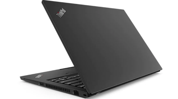
Late last year I bought a Lenovo laptop to replace my Dell Inspiron 13
laptop. I've loved that Dell — it's the perfect size, with an i7 processor --
but I figured out later its motherboard could only support 8GB RAM.
Over the past 18 months or so, the machine has been... slipping...
with occasional "senior moments" between running the BIOS and booting
into the OS. It's why I started looking for a replacement. I couldn't
believe my luck when I found this ThinkPad at a crazy low price on
Lenovo's Black Friday Weekend sale.
So here we are, about six months on. I use both laptops, side by
side — the older one I use for work; the newer I use for fun. I've
kept them both updated, and have marvelled at the speed at which my
new machine (goosed with 24GB RAM) installs updates. The older one
takes so much longer.
Last week (I think) I installed the new Windows 10 version 2004
on the new machine. With an update as large as that one, I figured
I'd better hold off on installing it on the Dell.
Today I tried installing the update, but Microsoft wouldn't let
me — Instead, I was shown a "learn more" link that reads as
follows:
Windows 10, version 2004 is available for users with devices
running Windows 10, versions 1903 and 1909, who manually seek to
"Check for updates" via Windows Update. We are continuing our
phased approach on initial availability, as we listen, learn,
and adjust. Today [as of June 16, 2020] were are slowly beginning
the training of our machine learning (ML) based process used to
intelligently select and automatically update devices approaching
end of service.
Clicking more links, I found this on a Microsoft blog:
You may not see Download and Install on your device as we are
slowly throttling up this availability over the coming weeks,
or your device might have a compatibility issue for which a
safeguard hold is in place until we are confident you will have
a good update experience.
I'm pretty sure I bought the machine at Best Buy in mid-March,
2015. So the machine is over 5 years old, and it had been running
Windows 10 version 1909 just fine... what the Hell, Microsoft?
I guess they're saying either there's something about my Dell
that 2004 won't yet run smoothly on, or they're saying my Dell is
old.
Link to this
Back to top
|
| 2020.06.24 |

A couple of months ago, my wife learned that D Magazine — a magazine promoting
the City of Dallas — was having contest to determine the cutest pet.
The rules were simple enough: voting was open to the public, and the public was
encouraged to vote as often as it wanted for the pets in the contest. That is, there
was no limitation on voting, and voting was as easy as clicking a button.
So I wondered, given these rules, if I could develop software that would do the
voting for us: something I could run that would visit the link that was the
destination of the button click, but do it in a way that wouldn't create problems
for other users — no denial of service or anything like that. Something that could
run inside of a loop and just click, but would also look like a browser to the server,
so the server would have data available to collect.
Over time, the project grew more and more mature. It really wasn't about my dog
at all — it was about learning something new, and adding more features as I learned
more about developing in Windows Forms: I wanted this to be a desktop application,
something outside of my comfort zone. And honestly, I hadn't built anything in
Windows Forms since maybe just after high school.
As the project matured, I thought a lot about the pace at which the application
operated. I decided to introduce a slow mode to really pump the brakes and run at
a pace of one click per minute over several hours. Steady clicks at a rate that
should not interfere with any other traffic. Slow and steady would win the race
for us — slow enough, in fact, that I even "wired in" sounds so I could run the
software minimized and hear a short beep each time a click was performed.
I also had the software output to a text file as an option, so one could see
the incoming status messages from the server. Shorter runs produced shorter logs.
One big breakthrough was in learning how to create menus. It made the app look
so much nicer than the simple tabbed interface I'd originally used.
 I found that 8-hour runs of 500 clicks at 1 per minute was the sweet spot.
I probably went a little over the top near the end of development, when I added
web services. Two calls: one to report the parameters at instantiation, and another
made intermittently to update the current click count. Using the web services, I
could monitor the run without having to visit my computer; I could do it right from
a browser on my mobile device. The first here: implementing web services on a
desktop app.
This was never about the contest. My dog isn't really very cute. I don't care
about having a professional photoshoot. He's a little pizza-stealing asshole who
glues himself to me whenever it rains. He's not pretty. But we do love him, and
he loves us so much. No, our good boi is simply a beneficiary of the development
— development simply done to satisfy my curiosity.
(Even if it was about the contest, there was nothing stopping the other 999
participants from building their own click machines too.)
The contest has two parts: the popular vote and the judging. How are we doing?
well...
 He made it into the top 20!
D Magazine notified us today that pup is a finalist, and their art department
made us the faux magazine cover. For me, this is enough. Really. If there
were no judges involved, and the prize was awarded solely on the popular vote, I
would explain things and insist the prize go to the next popular pet. I wouldn't
feel right about that. But because there are judges, that tells me there's more
afoot here than just clicks. (Besides, I feel pretty comfortable that he's not
the cutest in Dallas. I mean, look at him.)
Link to this
Back to top
|
| 2020.04.07 |
When I was working for the university, I was in a department that was split between web programmers
and mainframe programmers. The mainframe folks were all approaching retirement — I mean like they had
months to go before getting their full medical — many having joined the staff as punch card operators
way back in the day.
After a couple of years, the U decided it was dumping the mainframes and moving forward with Java.
All of the mainframers were given the option of learning Java or retirement. Suddenly retirements were
happening left and right.
I'm reminded of all of this because the Stte of New Jersey put out a plea for COBOL programmers to
support the state's 40 year-old unemployment insurance system. That system is run on mainframes which
run the 60+ year old computer language. New Jersey is looking for volunteers.
Link to this
Back to top
|
| 2020.03.21 |
COMPTIA asked me to take a survey for candidacy to take their new Server+ exam.
I thought it was weird, but... they asked. So I gave them a link to my LinkedIn page and a copy of my
resume, filled out a survey, and sent it off. Maybe I'll end up with a tee shirt.
Would I like another certification? Of course! But I don't want to get my hopes up for
anything here. Heck, I don't even know how I'd study if I'm selected.
At least there are more Pearson Vue exam places nearby than I could shake a stick at... no
shortage of exam facilities.
UPDATE:
From an email I received from CompTIA on March 2, 2020:
Congratulations, you’ve been selected by CompTIA to participate in the CompTIA Server+ Beta Exam!
If you take and pass the CompTIA Server+ SK0-005 Beta exam, you will earn the new certification
at no cost, plus CompTIA will pay you $200! Simply complete the beta exam by March 31, 2020.
Then the pandemic hit: public places have closed; restaurants are only available for take out;
the stock market went into the toilet, and there's no toilet paper to be found because idiots keep
buying it all.
The pandemic had reached the east and west coasts in advance of reaching Texas. On March 17th,
Dallas County issued orders which placed an emphasis on "social distancing" — the notion that people
need to stay apart so the virus could not spread as easily — including limiting gatherings to 10
people — even social gatherings on private property. With this order, followed by a state of emergency
declaration from the governor of Texas, it became clear the testing facility would not be open, and
likely would not reopen in time for me to take the exam. Time to find some guidance from CompTIA.
I visit the main help page on the CompTIA website, and it says, in very large font, that all
vouchers for currently scheduled exams are now extended throgh the end of June. This would have
addressed all of my concerns handily, but I knew the beta was on a deadline, so I chatted in.
Get this (names omitted):
| Chat started on 19 Mar 2020, 06:03 PM (GMT+0) |
|---|
| (06:03:05) *** I joined the chat *** |
| (06:03:05) Me: I was scheduled to participate in the Server+ beta exam. The deadline for
scheduling my test was March 31st. Has this deadline also been extended to June 30? |
| (06:03:18) *** CompTIA Customer Service joined the chat *** |
| (06:04:30) Customer Service: Good afternoon, I would be happy to assist you. |
| (06:04:56) Customer Service: Thanks for your interest and intention to take the Server+
SK1-005 beta exam. The beta exam cutoff date is March 31, 2020, and unfortunately, it's not
possible to extend this date in order to maintain the exam development schedule. We apologize that
not everyone scheduled to take the Server+ beta exam will be able to complete the exam, due to the
impact of the COVID-19 (Novel Coronavirus) pandemic. |
Cold.
(By the way, it's obvious to me that the customer service rep was copy/pasting a prepared
statement. These people do what they're told. The shade I'm throwing here is meant
for the Draconian fucksticks who made the shitburger she had to serve. And yes — I changed
the font of the response so it could appear as cold and impersonal as it seemed as I received it.)
CompTIA could have approached this differently. Softer messaging would have helped. A lot. Perhaps
because their messaging was as cold as it was, I got pissed off: Because CompTIA's guidance to beta
testers was to study as though I was taking an actual exam (that's almost a quote), I'd spent $200 on
CertMaster practice software (for the previous version of the Server+ exam) to study. I bought it
figuring I'd use it to pass the course, and the $200 would cover the cost. Now I wanted that money
back.
| (06:06:24) Me: Not cool. The state of Texas is under a state of emergency and there's no way
the testing center is going to remain open. |
| (06:06:50) Me: Also, I was counting on the $200 I was going to get paid to cover what I spent
on the CertMaster for the exam! |
| (06:06:56) Me: will I be reimbursed? |
More of that amazing bedside manner follows. Reading it in the voice of IG-11 from The
Mandalorian might help:
| (06:08:24) Customer Service: It's unfortunate that you and others scheduled to take the Server+
beta exam will not be able to complete the exam, due to the impact of the COVID-19 (Novel Coronavirus)
pandemic. We appreciate your intention to do so, and we'd like to offer you a complimentary voucher to
take the new Server+ SK0-005 exam once it launches (in lieu of the $200 Amazon gift card stipend). Please
confirm if you would like to receive a complimentary voucher for the new Server+ SK0-005 exam, and we'll
track this ticket and follow up with you when the exam launches. The new Server+ SK0-005 exam is currently
targeted to launch in July 2020, but this is subject to change. |
WOW.
Let's review. I was taking the exam in the first place because CompTIA asked me to. CompTIA promised
a free voucher for taking the exam, plus $200 for passing. So replacing a free thing with another free
thing and taking away the $200 thing doesn't seem like a good deal. Even my kid, when
she was 4, could do THAT math.
I did pursue the issue of reimbursement, and am waiting on a response. I feel I gave it a good
shot, anyway (again, names replaced):
[Customer Service Manager],
CompTIA approached me about taking the Server+ beta. It's not really in my wheelhouse, nor is it really
on my training trajectory, but I consider the offer and I'm accepted. CompTIA explains that I should
treat the beta as an actual exam, and that I should study for it as I normally would. So I bought the
CertMaster course to accomplish that. (Why would I do that? Have you seen the marketing materials?) After
the State of Texas makes a declaration about COVID-19, I see a post on the CompTIA help website that
says that all exam dates have been pushed out until the end of June. I chat in to be sure, and
basically get told to pound sand.
CompTIA asked me to take the beta. I agreed.
CompTIA asked me to study for it like a normal exam. I agreed.
Now I'm out money and time, and CompTIA has taken advantage of my goodwill.
Please make this right, and reimburse me for the expense of the CertMaster training. The Order Number is 719987.
Link to this
Back to top
|
| 2020.03.17 |
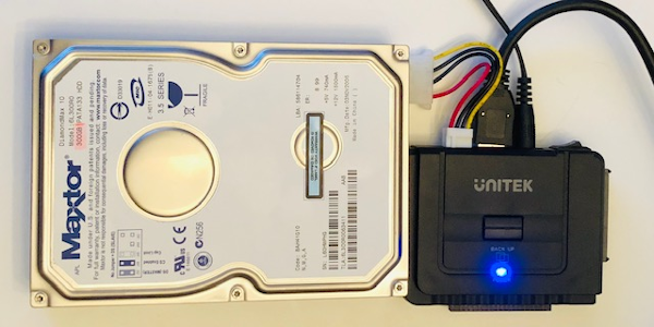
I have a bunch of hard drives from tower machines going back years and years. My intention has
been to either keep them for the data they have on them, or to wipe them before disposal.
Motivated by my studies for the Server+ exam, I figured I'd finally get serious about looking
at the data and wiping them.
In present day, I don't have a tower machine anymore... just my laptops, which use hard drives
of a much different form factor than the "bricks" from my old machines. So I knew I'd need a
way to access those old drives via a USB connection to my laptop.
After some online research,
I decided to buy a unit from Unitek to handle the hardware connection. The device is light
and compact — about the size of one's fist. It ships with a AC power cable (to power the device),
a small MOLEX power cable to connect to older hard drives, a USB cable for connection to the laptop,
and a small CD containing a program for the device's on-demand backup capability, if you care to
use the device that way. You'll also find a tiny red instruction booklet on how to use the device.
(Yes, of course I read it.)
The second thing I needed was software to handle overwriting the drive with data. I chose
Macrorit® Data Wiper for this job.
I found the software very easy to use, Windows 10 compatible, plus its available for free for
home use. One note I'd offer — Macrorit is a trademark of Bada Technology Co., Ltd. When you
install the software, you'll see that Bada name, not Macrorit. I'm very wary about installing
software from developers I don't know. Don't let the different name scare you.
The Walkthrough
To save you the trouble, here's how I erased my first drive — an old 300GB Maxtor PATA drive --
using this set-up. I'd recommend you set this up in early evening and let it run overnight.
Install the Data Wiper software on your Windows computer, but don't run it yet. Set the Unitek device near your computer, plug in the AC adapter, and connect the adapter
into a power source. Do not turn the device on yet. As you're looking at the device from above, with the AC adapter plugged into the top,
plug your old hard drive into the female interface on the left side. Now connect the provided molex cable to the device and to the hard drive. Connect the provided USB cable to the device and to your computer. Power the device up. You should see a new drive letter appear in Windows Explorer.

When you're ready to wipe the drive, open the Data Wiper software. Find the drive you connected — if your computer has only one hard drive, that
drive should appear as Drive 0, so your old hard drive should appear as Drive 1.

To hard wipe the drive, select Entire drive or disk as the Wipe target,
then choose how you want to wipe it: I went with DoD 5220.22M as my Security
level. These settings are above the partition displays, and to the left of the giant silver "WIPE NOW"
button. When you're ready, click the giant silver "WIPE NOW" button.
The software will prompt you a couple of times with "Are you sure?" prompts. I recall
it actually made me type the word "WIPE" to start the operation.

The wipe will take some time, depending on your computer's capabilities. I used a laptop
with 8GB RAM and probably a USB 2.0 port, so the operation was projected to take 12 hours.
I'd recommend setting all this up and kicking it off at about 7 PM, so it'll be complete the
following morning. Once the wipe is complete, you'll see the target drive is now shown as uninitialized.

Turn off the power to the Unitek device. Carefully remove the molex cable from the hard drive. Detach the hard drive from the device.
The wipe took about as long as the software had initially expected. The hard drive was warm to
the touch during the wiping process, so keep that in mind if you have mobile little ones or pets.
Link to this
Back to top
|
| 2020.03.07 |
Have you ever wondered how much power your PC or laptop consumes? I work on a laptop all day
long... how much juice does it pull?
While studying for the CompTIA Server+ exam, I encountered several statistics for use when
troubleshooting computer problems:
| EQUIPMENT | POWER |
|---|
| MOTHERBOARD | 30 W |
| CPU | 45 W - 150 W |
| RAM 2GB | 30 W |
| OPTICAL DRIVE | 5 W |
Notice the power consumption for RAM is 30 W for every 2GB installed. If you consider a standard
laptop ships with 8GB installed, you're talking about power consumption equivalent to two incandescent
light bulbs.
Assuming a minimal demand on the CPU, a laptop with 8GB RAM is puling about 200 W — with over
half of it being consumed by the RAM.
Link to this
Back to top
|
| 2020.02.25 |
COMPTIA asked me to take a survey for candidacy to take their new Server+ exam.
I thought it was weird, but... they asked. So I gave them a link to my LinkedIn page and a copy of my
resume, filled out a survey, and sent it off. Maybe I'll end up with a tee shirt.
Would I like another certification? Of course! But I don't want to get my hopes up for
anything here. Heck, I don't even know how I'd study if I'm selected.
At least there are more Pearson Vue exam places nearby than I could shake a stick at... no
shortage of exam facilities.
Link to this
Back to top
|
| 2020.02.02 |
All done!
Both of my CompTIA certifications have been extended through May, 2023. How cool is that?
Link to this
Back to top
|
| 2020.01.31 |
Three years passes in the blink of an eye.
And jeez what a busy three years it's been. I originally got these certifications because my job required I had
at least one. For good measure, I got two — thinking I'd look good for the government contract, but also it could
open a path into a cybersecurity career.
I have no complaints about CompTIA's CertMaster CE program. You read over the material and take the assessment.
Once you can pass all assessments with 100% correct, you're done with the course and your certification is extended.
I thought it would take me much longer than it currently seems to be; I'm over halfway done and I only started the
thing two days ago.
Plus, it's a little cheaper than retaking the exam, and you have access to the course materials
for a year (if retaking the course way before your certification expires is your thing).
Link to this
Back to top
|
| 2019.12.22 |

I'd mentioned before that I was concerned about the ability to expand
the RAM in the Lenovo ThinkPad T490. I bought the machine based on the
customer support representative's information: (1) that yes, it is expandable
and (2) The board will take up to 40GB RAM.
I couldn't surf to Crucial.com fast enough. Found a 16GB stick that
appeared reasonably priced, and placed my order.
Ten days had passed when I contacted their customer service. I hadn't
received so much as an order number... in the past, my order would have
arrived sooner than that.
I got the order number from the chat specialist, and used their online form
to check status... it told me my order was out of stock. Through an additional
and completely half-assed subsequent customer service interaction over email,
I learned they also had no idea when the RAM would be back in stock. WTF?!?!
Why did Crucial let me order something that was out of stock with an undetermined
arrival date?
Then I ordered from Kingston. It arrived quickly, and the upgrade operation
lasted about three minutes. BOOM.
Crucial is not the same company it used to be. I won't buy from them again.
Link to this
Back to top
|
| 2019.11.30 |

I love love love my Dell XPS 13 laptop. It's been quite a nice workhorse.
I bought it at Best Buy several years ago, and over time I've learned a few things
about it that soured me a bit on the experience — primarily, that I couldn't
expand the RAM beyond the 8GB it came with. But with the Intel Core i7 processor,
it's still been a very capable machine — capable enough that I would absolutely
order another through DELL (with a custom configuration, of course).
That is, I would have purchased another through DELL, if it wasn't for
the ThinkPad I was issued by an employer a couple of years ago.
I was really taken by a few things about the ThinkPad. One, it was amazingly thin. Two,
the keys had a nice feel — and that's super important to me. Years ago I had a Toshiba
laptop that I regretted buying about a week in because the keys wouldn't give good
feedback to my fingers. I had to constantly retype things because it felt like I wasn't
striking keys — I was just pounding on a flat surface with my fingers. But the ThinkPad
T470s felt good. Three, the ThinkPad had a docking station that allowed me to run multiple
monitors from it, and to secure the machine to it. All-in-all, I really enjoyed my experience
with that machine. PLUS it was a 14" laptop. A little larger than my personal DELL, but it
didn't feel big.
So, for funsies, I started surfing yesterday for Black Friday deals. Not as a serious
shopper — just as a curious consumer. I started at Dell, and didn't find anything exciting
there. Then I hopped over to Lenovo... where they were selling the T490 — a $1900 machine --
for $749?! What the what?!!
Things got more serious. I reached out to their sales support people to address a single
concern: is the RAM expandable beyond the 8GB it ships with? Answer: Yes - the board can
handle up to 48GB!!
I couldn't bring myself to pull the trigger on it yesterday. I let it sit in the cart
while I was wracked with indecision. Laurel and I have been working very hard on getting
debt paid down. To me, this represented a significant detour from our plan, despite my
current machine's occasional "senior moments." So, with that, I let it go.
Fast-forward to morning coffee today. Laurel mentioned we now have a little money coming
in we weren't expecting — compensation from an auto accent at the start of the year. So
she gave me the go-ahead to buy the laptop if I still could.
With a mixture of excitement and guilt, I powered up my Dell and pointed the browser
back to the Lenovo site. I was amazed to find they'd extended their sale — and that the
T490 was still in my cart at the discounted price!
The new machine should be here this coming week (SQUEEE!!).
Link to this
Back to top
|
| 2019.11.29 |
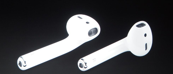
I had to replace my AirPods. RIP set one, November 2019. I replaced them
because one of the pods' batteries wouldn't hold a charge for more than about
a half hour.
If you look at one of the ear pieces, you'll notice there are basically two
sections - the part that goes in your ear, and the part that hangs out of the ear
pointing downward. Apparently, the latter part houses a long, thin battery. After
two years, this one piece simply couldn't carry on.
My new pair are perhaps of a later generation, or later model. The case surely
is, anyway — it can charge by sitting on a pad or by inserting the proper cable.
Finally, A check of my battery life after 10 minutes of playing music showed
a decrease of 3%; extrapolating, that means an hour of playtime should drop the
batteries by about 18%, meaning I ought to have about five and a half hours of
playtime before the new AirPods require recharging.
Link to this
Back to top
|
| 2019.11.09 |

Sometimes I forget to engage my PawSense software, and the cat gets
one over on me. The other day I came home from lunch and found she had
renamed one of my Outlook folders with an extraordinarily long string of
the letter "P", plus the magification on the active window
was set so high I could see a few giant letters and the window close
button.
Of course this led me to consider other solutions.
I use — and adore — the Microsoft Sculpt ergonomic keyboard. It uses
a wireless transceiver to communicate with my laptop. The transceiver is a
teeny tiny USB dongle. I briefly considered simply unplugging it and putting
it in my pocket when I leave my desk for long periods, but the unit is so
tiny that it could easily fall out of my pocket when, say, getting my keys
out or something, and I'd never know it. Plus, the transceiver and keyboard
are paired by some means below the software level; one can't just buy a
replacement transceiver and pair it to the keyboard. So any solution involving
arresting the keyboard must exclude removal of the device.
Why not just lock my keyboard? Doing that engages the screen saver or
background, too. Certainly a very good idea — good enough to be SOP
at an office where prying eyes are about. But I'm working from home, and
want to leave certain communication software up and visible. I know how
nitpicky this is. But not everybody uses only one machine or one location
for everything.
My ideal answer came in the form of a USB hub my daughter had bought
from Amazon. Made by a company called Sabrent,
it is a four-port USB hub with the added feature of a button above each port.
Push the button in to engage the port beneath it. This allows me to
disconnect the transceiver from the keyboard with the touch of a button, and without
physically separating the transceiver from the port. AWESOME!
It's probably the next best thing to a switch directly on the keyboard
to turn it off (which I wish the Sculpt actually had).
Now my cat can sit her fat butt on my keyboard while I'm not around and
no input will be passed into the laptop. It's SUCH a beautiful thing.
Link to this
Back to top
|
| 2019.10.30 |
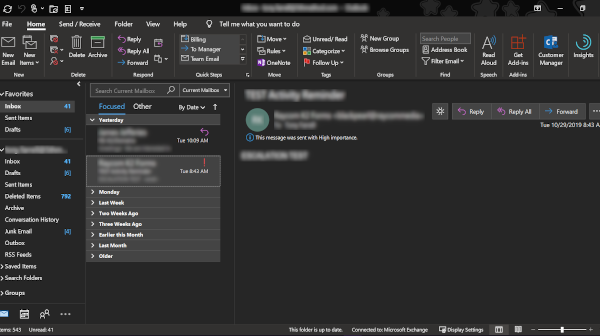
This week, the Office team at Microsoft FINALLY came through with something
I've been wanting for a long, long time.
Microsoft Office has had a dark theme for a while now, but it didn't
quite seal the deal in Outlook, because the theme did not
extend to the message pane... until this week.
Microsoft rolled out its new Dark Mode in Office 365, which finally
goes the last mile and gives the Outlook message pane white text on a
black background.
I'm a huge fan. And very, very grateful. It's just sort of a shame that
Apple introduced it in iOS first.
Link to thisBack to top |
| 2019.10.17 |
Do not attempt to adjust your browser.
We are controlling transmission.
Lately I've been working pretty hard on a new stylesheet for the iPad. I was pretty
happy with it, but it suddenly stopped working. I frantically went through my code
to figure out what I broke — then I realized I hadn't broken anything. Apple did.
...In a way.
The new iPadOS is here. I believe this is actually a fork of the iOS code, now
meant to concentrate solely on the iPad as a platform. Along with the new operating
system, a subtle change in Safari's behavior: it now requests, by default, desktop
versions of websites. Put another way, stylesheets made specifically for devices like
the iPad are now ignored by default.
To make Safari stop requesting desktop websites by default, - go to Settings > Safari.
- In the right pane, scroll down to a region called SETTINGS FOR WEBSITES
- tap on REQUEST DESKTOP WEBSITE.
- Under the heading REQUEST DESKTOP WEBSITE ON,
switch the "All Websites" toggle to OFF.
Link to this
Back to top
|
| 2019.10.08 |

Apple, you tried so hard and for so long to make me sign up for Apple Pay. In iOS 13, you
even went so far as to tie the setup of the new operating system to your beloved Apple Pay.
So I signed up for it because I wanted to finally. Shut. You. Up.
I figured that having it didn't mean I had to use it. Oh, but I DID have to use it.
And thanks to Jersey Mike's, I now appreciate Apple Pay.
Jersey Mike's sandwich shop is a place where my family and I pretty much always get
the same things. I ordered from there online once, and the site suggested I'd receive
some sort of reward for using their mobile app... so I downloaded it, and used it the next
time I placed an order. The app allowed me to mark the order as a favorite, so on future
orders I'd just find the favorite and all would be set.
Six taps.
Six taps and a double-click is all it took to order sandwiches from there today.
The double-click was the payment part, through Apple Pay.
And now I appreciate it. Now I get it. Using Apple Pay was SUPER easy. I had the
entire order done in 30 seconds. Again, six taps and a double-click is all that
stood between me and a #9, Mike's Way, no onions.
Link to this
Back to top
|
| 2019.09.27 |

This morning when I opened the Facebook app on my phone, I was
notified that Smart Lists are going away.
Smart Lists are lists that Fecebook makes automatically,
based on certain elements in your profile that you have in common
with friends, like home town, current city, and workplace.
Facebook advises that posts that use Smart Lists for access
control will be converted to "Only Me" privacy when the Smart
Lists feature is deleted.
For me, I have tons of posts from previous years that have at
least one Smart List as part of a custom privacy setting. As a
precaution, I archived all of the Smart Lists I have in my
queue, hoping to prevent those posts from becoming inaccessable.
Link to this
Back to top
|
| 2019.09.27 |
My wife has given me an Apple Watch Series 5 (44mm) as a gift to replace my
Series 3. I thought I'd offer some thoughts on the setup for others who have
found it's time for an upgrade.
Right off the bat, you're asked if you want to set up the Series 5 as a new
watch, or to restore from backup. I opted to set it up as a new watch, but my
wife advised (a little late) that I should have opted for the restore from
backup option. (Happily, I later learned the Apple Watch app on my phone can
differentiate between the two watches and control them both. That's pretty slick.)
The first thing I noticed when I pulled it from the box is how much larger the
display seems to be. My Series 3 is a 42mm; it shouldn't seem that much different.
But when I was asked to add a password once it was on, I was pretty surprised by
how much larger the display seems; the digits seem much bigger than they do on the
Series 3. I believe the difference is that the display is longer than previous
versions were, and this length offers some nice changes to support rectangular
faces.
Okay. Let's make with the unsolicited advice. Here are my do's and don'ts:
Don't Push All Your Apps
The watch offers one the option of pushing all of one's phone apps over automagically,
or the option of doing it manually. Personally, I don't want everything that has
a companion Apple Watch app pushed onto the unit. I use very few of them; there's
no need for them all to take up space... or RAM.
Don't Let Content Fill Available Space
I hvae a pretty big music collection. But I listen to it on my phone, not
my watch. So while I'm thinking about it, in the Apple Watch app with my new watch
selected, I scroll down the list of apps — not available apps, just the apps
onboard by default — until I find music. When I tap into the menu item, I
find that Apple has by default set my watch to download music I play in heavy
rotation, plus three different curated mixes updated weekly... it turned all
of those switches off.
I then do the same with the Audiobooks menu: I turn off the switches for
"Reading Now" and "Want to Read."
Both Music and Audiobooks will automatically fill available space on your
watch with content. The problem I have with this is updates to Watch OS won't
install if you've no available memory. That's why I ensure these are all shut
off.
Don't Let Your Watch Pester You with Everything on Your Phone
If you want to experience how annoying the Apple Watch can be, all you
need is one group messaging thread.
As every message comes in, the watch will give your wrist a sharp tap.
One very active group thread was enough for me to learn that the watch
does not have to tell me about everything happening on my phone.
In the app, navigate to Notifications, then scroll way down to the section
that reads "MIRROR IPHONE ALERTS FROM:"; now turn off the notifications from
any app you don't feel is important enough to nag you about. Do I want
notifications about my flight? Yes. Maps? Yes. Facebook? Nope. Outlook?
Absolutely not. Flavor to your taste.
General Settings
The first thing I do here is scroll down to the Wake Screen item and
zealously disable Auto-launch Audio Apps.
Monogramming
One of the settings under Clock is for a monogram. I've published instructions
in the past on how to set this to the Apple logo, if that's of interest
to you.
Now for the Best Part: The Faces
Sex sells. And you can bet these sexy watch faces are a big part of
why these units must be flying off the shelves. I have a couple early
favorites:
- Solar Dial. The new and improved solar watch face is
completely gorgeous, with the time placed prominently across from the
relative position of the sun in the sky and four complications, all
displayed in hues of blue.
- Meridian is the default face displayed when the watch
setup completes. One of the really nice things about it is its white face
presents when your wrist is lifted, but the face fades to black when your
arm is returned to your side. That is, you can still see the hands and its
four complications all grouped toward the face's center which are set to
multi-color by default, really showing off the beauty of the new face.
- Infograph is similar to Meridian, except the
Infograph face is circular, as opposed to Meridian's more rounded
rectangular face. Infograph features a series of up to eight complications --
four circular ones clustered near the center (like Meridian), plus four
that appear at the corners. Information overload all right at your wrist.
Functionality
The new Watch OS does behave differently based on which version of the
Apple Watch you have. One nice improvement I noticed on the Series 5 is
that it will show you the time even if the last thing you were displaying
was something other than a watch face.
Say you're doing what you do when a summary of a news story pops up on
your Apple Watch. So you read it and drop your wrist back to a natural
position. When you next look at your watch, a clock appears over the
blurred image of that news story you didn't dismiss. I think it's a nice
touch... I feel it was somebody's pet peeve — it seems rather a specific
use case, no?
What Next?
So now I have my super shiny Series 5. What do I shop for next? More
watch bands? Well, maybe. Happily, I'm told the bands I already own from
my Series 1 and 3 will fit it. But I'm actually thinking about screen
protectors instead.
The screen on my Series 1 smashed when the watch fell from my wrist. My
Series 3 has a few scratches from bumping the face against various things.
I don't want this Series 5 getting the same kinds of scratches, and a screen
protector might prevent the screen from smashing from a fall. I'll be
placing an order through Amazon here shortly.
Summary
The Apple Watch Series 5 is a beautiful, beautiful machine. I've found
these watches to be very reliable, and indispensable. If you're careful
about balancing the software and content you'll actually use against the
software and content you have available, you should be able to perform
upgrade after upgrade without complication (pun totally intended), and
enjoy it for years.
Link to this
Back to top
|
| 2019.09.23 |
iOS 13 installed very smoothly on my iPhone X. Between the new OS and my new glasses,
I feel like I have a brand new phone.
I'm not a power user or anything, but I've been an iPhone customer since the iPhone 3G,
so I think I know a fair amount about how the product has evolved, and how I use it.
Based on these, I'd like to tell you what I LOVE about iOS 13.
Dark Mode
I'm a programmer. I'm on a computer (full disclosure: a Dell PC, not a Mac) for over
eight hours each day. I'm a big fan of software that lets me run in dark mode on my PC,
so you can imagine how happy I was to learn that iOS was also coming to the dark side.
Now I just need the app developers to implement the new capability into new versions
of their apps.
Improved Share Sheets
Select a photo from your library and opt to forward it. Instead of seeing a share
sheet with an open area for AirDrop and some other options, you now see forwarding options
for the people you're in touch with most often as a top row, a list of applications as a
second row, and other options in a scrollable list below that. This new format is far more
useful than was previously available. I'm really glad Apple rethought this.
Memojis
The introduction of personalized animated emojis ("memojis") was a very nice novelty-—
cool that you could animate them using facial tracking. But I don't know how widely used
they ultimately were. Bringing up your memoji then recording yourself responding in
conversation was kind of a lot of work, so I think they were largely ignored. In iOS 13,
Apple introduces us to some preset memojis with various common emojis as facial
expressions — that is, YOUR memoji's epressions — all ready for you to use. It seems
many of the most commonly used emojis are represented here. Very slick.
Plus, memoji construction is more advanced. I could finally add my single hoop
earring to my left ear!
Integration of Bedtime Clock with Other Clock Functions
The bedtime feature has been pretty nice, but it always seemed weird it wasn't
integrated in with the other clock app functions (like timer, countdown, and the
other alarms). No more: this is rectified in iOS 13. The bedtime alarm may even
be disabled and enabled on the alarms form. Still, it's not fully integrated:
the bedtime alarm sounds are still exclusive to the bedtime feature.
Link to this
Back to top
|
| 2019.09.13 |

Summerland in my past
Days were full and I knew it would last
I never thought there was anything else but you
Summerland
The wind is getting cold
Summerland
You're finally getting old
About two weeks ago I noticed a significant shift in my near-field vision.
At first, I thought I was just tired from having spent too much time working
that day, but when I noticed this was happening evening after evening, and
that adjusting the text size on my phone made very little difference, I realized
I had become dependent on my glasses for reading just about everything up close.
The glasses made things manageable, but not clear.
New glasses are on the way. My prescription now includes a Near Add value
of +2.00. Holy shit. I'd never had additional correction before. Suddenly I'm...
Suddenly I do.
Link to this
Back to top
|
| 2019.08.25 |
Years ago, I had a really powerful PC, loaded with all of my programming stuff
as well as a bunch of "kill-kill-kill" games. Packed with RAM and processing power,
it was a really sweet machine.
Fast forward a few years. I was in a different place in my life — both
figuratively and actually. Eventually, my "promance" with my PC fell apart, and
for three reasons: - I stopped playing the kill-kill-kill games because I
had a four year-old in my house and usually attached to my hip;
- If I wasn't
playing PC games, what was I doing with it? Paying bills, mostly
- Occasionally
I'd have to use it to connect to work and troubleshoot system problems in the middle
of the night.
I also found that not only was I avoiding my computer, but I was avoiding the
desk it was on, too. My computer desk used to be where I'd go to have fun. But
at that point, it was where I would go to sort and pay bills. In short, that wasn't
a fun place anymore, so I began to avoid it. And that's when I figured out how
wrong it was to actually avoid anyplace in my home.
Years later, I had a work-from-home job for a company near DC. THIS time, I
put my desk someplace in my home that I wouldn't normally go — someplace I would
deliberately have to visit to do work: in a corner of my basement. Great idea --
but execution was a little lacking. I spent hours and hours each day in a musty
basement.
Present day. As a contractor for my current company, I do my work by remote
connection through my personal equipment. Happily, my "office" is in a part of my
home that isn't in the usual stream of life here — and not in a basement (they
don't build basements in this part of Texas). My client has a ton of work and is
very eager to my current project "under our belts," so I work 9-hour days for
them... my weeks seem long, and so the zeal I normally have for working on my
website on the weekends has ebbed.
And that hurts.
I spend so much time in this chair each day — working through a punch list,
tracking my time, taking calls, making notes... no wonder I don't want to sit
here on a Sunday afternoon, even if its to do fun things.
This is a signal to me that I need to slow down, or slog less, to get back to
wanting to fire up QUAKE and mess around for a few minutes. I'll get back there --
I usually do — but right now I just need a little space.
Link to this
Back to top
|
| 2019.07.08 |

I'm starting a position with a new company next week. I'll be working remotely, which
means I'll be depending on my personal mobile phone for voice calls. Not that I mind
that so much, but over the past few years I've learned the value of keeping my private
number private. So I thought back to the days of Google Phone, and wondered whether
a present-day app could do the same.
I'm considering two apps - Burner and Hushed. I'm reading reviews
of both, and I'm leaning toward Burner. But then it hit me — these apps
provide exactly the same kind of service that keeping multiple addresses does for e-mail:
lets you quickly separate "spam" and solicitations from content you actually want.
This was sort of a bellwether moment for me — the idea that as communications
technologies emerge, we'll always develop a need to fight unwanted traffic. It didn't
take too long to catch onto the idea that you should have two email accounts: one for
transactional use — buying stuff online, for example, because you're going to get
spammed the moment your purchase is made — and one for personal use. Fast-forward to
the smartphone era, when early adopters got onto apps like these to separate their personal
line from whatever else they were doing (one reviewer of Hushed identified as running
a "strictly-platonic cuddle business"). These apps must be becoming more popular —
within the past couple of months I saw some press on the mobile phone carriers being
given the authority to crack down on robocallers.
The same is obviously true for social media — Facebook got called on the carpet
for not doing enough to combat the emergence of accounts spreading Russian propaganda
in advance of the 2016 presidential election, and still gets blasted at the federal
government level for leaks of private information (think Cambridge Analytica).
Tumblr, another social media platform, saw a huge percentage of its user base leave
late last year because Verizon was having trouble monetizing the platform. Put simply,
Verizon updated its acceptable use policy to drive out the porn communities so they
could sell ads; but then they found they didn't really have anybody left to sell ads to!
It seems that in the digital age, regardless of the platform, somebody always
has to be the reason we can't have nice things. PCs got viruses. Email has spam. And
phishing. And spear phishing. Voicemail? "Vishing." Phones? Robocalls and other assholes
out to trick the elderly, and people "calling from Microsoft because my computer has a
virus." It's just absurd, the shit people do.
People get new technology, and then they have to think of ways to protect themselves
while using that new technology. Protect themselves from everything from invasive
advertising to bad actors. In a world where YouTube actually interrupts a video to
show you an ad, I'm afraid that's just how it's going to be. Forever.
And the "bad actors" thing brings me back around to burner phone apps. You know, with
GMail, all of the data you receive and send via GMail is available for them to do whatever
they want with: 1
When you upload, submit, store, send or receive content to or through our
Services, you give Google (and those we work with) a worldwide license to use, host, store,
reproduce, modify, create derivative works (such as those resulting from translations,
adaptations or other changes we make so that your content works better with our Services),
communicate, publish, publicly perform, publicly display and distribute such content.
Personal assistants monitor you all the time. And anything that gets recorded is stored
and tagged and analyzed by a legion of linguists who will do who knows what with the data
they capture. So as I think about something like a burner phone app, I have to wonder:
who owns the data?
Who Owns the Data?
Ad Hoc Labs is the maker of Burner. Their privacy policy, dated 2015, explains that they do collect
personal data "when you use certain services" (which they do not identify), and that they
will "use your Personal Data to provide you with access to such services and to monitor
your use of such services." In short, whatever you're saying over that line or text is being
captured on your phone, sent to Ad Hoc Labs, and shared with other companies:
By voluntarily providing us with [personally identifiable data, aka]
Personal Data, you are consenting to our use of it ... you acknowledge
and agree that such Personal Data may be transferred from your current location to the offices and
servers of Ad Hoc Labs and the authorized third parties referred to herein located in the
United States.
Interestingly enough, the privacy policy says that you can use the app without providing
any personal data, but that you may not be able to use "certain services" as a result.
Try Before You Buy
I have decided to try Burner.
After reading some of the reviews, I was a little worried that the app would try to
trick me into signing up for some sort of premium service, but I found the setup to be
pretty straightforward. I'm on a two-week trial that has limited services — 20 minutes
of phone time and a maximum of 40 texts. I chose the number from lists of about ten
numbers associated each area code I selected.
One thing I'm really excited about is that the Burner app appears to interface with
Nomorobo, a subscription service I have that notifies me in real time of calls from
numbers reported to be bad guys.
Burner also reports it integrates with other serivces. For example, Burner shows how
I can use its Developer connection to integrate with IFTTT and Zapier. But when I tried
the IFTTT integration, it appeared that IFTTT had no idea what Burner is, and had no
intention of connecting with it. Granted, this is nerdy advanced stuff that isn't critical,
but, if it SAYS it can connect with IFTTT, I expect it will connect with IFTTT. Burner
will actually integrate with Dropbox, which I think is a very nice plus.
So I'm going to publish the Burner number on my outgoing messages, for the client
to use. So far, I've received no robocalls, no texts, no messages, which is a great sign --
I interpret the silence as the line has probably not been cloned or the target of
suspicious campaigns.
Tempus Fugit
So, it's Monday, and Burner is already trying to tell me my trial expires tomorrow:
For reference, when I created the number on Saturday, the app showed that it expires
the following Saturday. The app still shows the number expires in five days, regardless of
their poorly-implemented popup message.
Things like this are irksome. I don't tolerate them well. Maybe I'm predisposed to be aloof
because of the reviews I read, but telling me two days into a 7-day free trial that my trial
expires TOMORROW certainly doesn't read like an honest mistake.
Not cool, Burner.
|
 |
I'll update this post as warranted.
Link to this
Back to top
|
| 2019.06.08 |

Thank you, Apple.
I'm loving your most recent WATCH OS 5 update (5.2.1). The other day, I was
out doing some walking and returned to my car. The watch showed me a message which
basically reminded me to stop my workout — I'm HORRIBLE at remembering to do that.
Then this afternoon, I was in my pool when the watch detected I was probably
swimming, and asked if it should start a workout for me.
Damn convenient updates, Apple!
Link to this
Back to top
|
| 2019.05.22 |
Ransomware is software that gets introduced to usually a company's data systems
by a malicious actor (who wrote the program) and a generally unwitting victim (who downloaded or
activated it). The victim clicks a link in an e-mail message or a web page, and that click connects
that person's computer to a computer elsewhere, which transmits a file back to the requesting machine.
Like almost any computer virus, the file spreads itself to all the other machines on the local
network. Ransomware programs differ in that they encrypt the contents of the hard drives and advise
the victim that they must follow a series of instructions to purchase the decryption key. Some versions
demand payment be made within a specific amount of time; others increase the cost of the key as
time passes. Given the strength of modern encryption algorithms, the data is lost without the key.
In this way, the affected machines are being held for ransom by the software — hence, "ransomware."
Ransomware is also something that I read about in tech news stories and summaries. It's...
it's a far-off thing for most — something we've heard of like so many bad things in
our world, but it's never close enough to be... real.
Well, here's reality: I've just learned of a friend whose company was struck by a ransomware attack. I
don't know any details beyond that, except to say that if the company is unable to meet the
captor's demands, it could go under.
I don't want to see my friend out of work, especially due to something like this. In the IT
world, the job market is volatile enough without threats like these. Why,
in my own resume I mention, as a final bullet under certain employers, the circumstances
of my departure: layoffs, end of contract, that sort of thing. Way back in my history I
do have an instance where the company I'd worked for for several years closed. It's far
enough back now where I don't generally have to reference it, but back when I did, it was
always awkward to have to say "I did all these great things for this company, but you
can't contact them for a reference because the company is gone." It caused problems for me
for years.
I wish him and his company great luck. I don't know how many people
the company employs, but I seem to recall it's a small shop. Hopefully law enforcement has
been engaged, and they'll resolve it without the company suffering too greatly. I'm
convinced all these captors want is money; but in situations like these, they get no
money AND they ruin lives. Is that really acceptable collateral damage?
Link to this
Back to top
|
| 2019.03.27 |

In it's initial announcement about the AirPods, Apple promised:
- AirPods would sound great,
- AirPods would power themselves off when taken out of the ear,
- AirPods could be used individually, and
- AirPods would recharge quickly.
Two years on, all four are still true. Battery life was a concern I had going in,
and today I took a measurement to figure out how long they would play before
giving me the warning beep.
1 hour, 52 minutes.
When I wrote my first post about them in January 2017, I estimated about 1 hour
45 minutes of service, which forces me to consider that they haven't lost anything
on battery life at all.
Link to this
Back to top
|
| 2018.12.31 |

Posts about politics and national issues dominated the interests posts in 2018, with
some healthy side-effects: posts on books rose 500% from last year. There were maybe
some not-so-healthy side effects too: fitness posts were way down, and I started a new
topic about whiskey (!!).
| Topic | Count |
|---|
| books | 6 |
| car | 1 |
| cooking/food | 4 |
| family/kids | 9 |
| fitness | 3 |
| gaming | 5 |
| geek | 10 |
| leadership | 0 |
| movies | 4 |
| music | 1 |
| nation/politics | 21 |
| texas life | 5 |
| whiskey | 3 |
I published far less interests content this year than I had in 2017 — and for
good reason: I spent far less time in front of a keyboard this year. We moved to
Texas (the inclusion of Texas life and whiskey
topics should have provided a prtty big hint) and I spent every day I could
in our pool with kiddo, reaching all the way into NOVEMBER. Between the move and
the sun, it's little wonder I'm not seeing the numbers I saw in 2017.
The nature of my posts were different this year, too. Those national
interest posts were typically very long and very involved, with a lot
of research behind them — most of the time, they were news articles (The
Washington Post is my main source because I'm a subscriber), but in some
cases, the sources were books that I'd read from cover to cover. So, fewer posts,
but with much more behind them. I wouldn't call it a format change; I'd just say
it's a function of the content — it demanded greater discipline and effort.
Finally, I split some content out into new topics this year. Kids/Family
was used for probably most things family-related, and eventually I split out the
posts related to our move and adjusting to life in Texas into its own topic.
The cooking topic was renamed to food, so I
could talk not just about dishes I prepare, but others I got to experience not
of my kitchen (I still miss forkly). The new whiskey topic is
separate from food, because I wanted to highlight our new discoveries in their
own topic.
Link to this
Back to top
|
| 2018.12.04 |

I was lucky enough today to sit down with a solutions architect who walked me through a simple
test-driven development (TDD) and behavior-driven development (BDD) exercise.
My mind was blown. It was everything he said it would be: it's challenging, because you have
to think differently about the problems you're solving — first and foremost, you have to partition
your mind to focus only on the test — it's givens and the outcome you're looking for (this is the
test-driven part) — and
THEN to focus on writing the code to satisfy the outcome (this is the behavior-driven part).
The net result is amazing and mind-bending. By making yourself think in this way,
the code is reduced to the means of satisfying the tests. In that sense, it is pure.
I've worked for several organizations that all said they wanted to move to TDD,
but couldn't. One reason: clients didn't want to pay for it. TDD pushes out the time
to produce an application, but the benefit is the code doesn't fail. Add to that a
continuous integration server that runs your tests and re-runs them when others
check in their test-driven code...
I guess I want these guys to understand how lucky they are that they actually
get to engineer in this way. I think it's super amazing. I'm SO grateful for the demo
I received today.
Link to this
Back to top
|
| 2018.09.18 |
This post is going to be quick, just like the upgrade: My upgrade went super fast, and
I didn't even have to log back into iCloud or anything. Even after I shut the unit down
and restarted it. My upgrade experience couldn't have been smoother.
Link to this
Back to top
|
| 2018.05.19 |

Windows 10 users who have experienced the April 2018 update (a long update process with
multiple reboots) may notice a different icon where the Task View icon used to be.
The new icon seems to resemble a film strip with a slider bar to its right. It actually
suggests some new functionality inside of the task view: the ability to recall certain
applications or documents you had open recently and insert them into one of the virtual
desktops.
The new feature is called Timeline. It tracks all of the applications and documents you
had open recently. Paired with Task View, you can select a virtual desktop, then click on
an application in the timeline to load it into the virtual desktop.
Thankfully, one still switches among desktops using the same key chord (Ctrl+Win+(left
arrow or right arrow)).
I suppose Timeline could be useful for setting up all of your virtual desktops at once
from the Task View. Personally, I don't think I'd work that way, but then I'm fairly
regimented in how I use them — I tend to always use certain applications within certain
desktops (so you'd think I'd find Timeline useful).
Now, if I had a way to run a PowerShell script to set it all up for me at the start of
a session, THAT would really be something. Of course, I'd need suitable resources (RAM)
to support it.
Of course, I'm coming at this from the perspective of using Timeline on a single
machine. The real power of Timeline, as PC World reports, is for users of multiple
machines. Timeline will sync your history to the cloud, making it available for you to use
from any Windows 10 machine.1
Also nice: you can turn Timeline off if you want to. Navigate to Settings > Privacy >
Activity History. Two checkboxes should be visible at the top of the form.
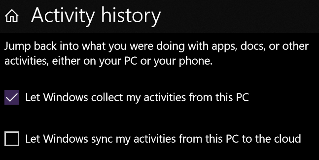
Let Windows collect my activities from this PC is likely checked by default, and
allows the machine to record the applications you've had open so they can be shown in the Timeeline
feature. Let Windows sync my activities from this PC to the cloud may be
unchecked by default, and is required to present your Timeline on different PCs.1
Unchecking Let Windows collect my activities from this PC is not enough to
clear the Timeline. In the testing I did, I found I had to scroll down further on the Activity
History form and click the button to clear the history to erase the Timeline.
My original post about the Windows 10 Task View and virtual desktops may be found
here.
Link to this
Back to top
|
| 2018.05.09 |

I started looking into Microsoft Power BI for work, and thought I'd use some data from
my website as a test. I was very impressed at how powerful and easy to use Power BI is.
There's a lot of functionality packed in there by default.
For example, date data is imported in a heirarchical nature, so the graph, which is
currently showing the number of posts by year, can be reorganized to show posts by month
and posts by day of the month. (The graph showed me that I tend to post significantly
more to interests topics on the 7th of the month than I do on any other day. I wonder
why that is?)
One can also highight certain topics on the graph by clicking on them in the legend.
Clicking on a topic will fade the other topics in the graph, which helps the data you
want to see stand out.
There are some things I could clean up inside the data here (like the legend), but
considering I threw this together with raw data, I'm really impressed with how easy
this was to make!
Link to this
Back to top
|
| 2018.04.10 |

A couple of weeks ago I wrote a post about Facebook privacy, and how one can
examine and change settings related to the data you're giving to
third parties through the use of Facebook authentication (that is, using Facebook
to log into third-party applications and websites).
This morning I realize that everything I put in that post will not be enough
to significantly help you keep your information from being leaked to third parties.
The reason is the entire point of social media: connection with other people.
Yesterday, I was confident I wouldn't be seeing the warning banner that Facebook
talked about displaying to the 87 million affected by the Cambridge Analytica
scandal. This morning, I can reproduce for you exactly what that banner said.
Despite my elaborate system of lists to compartmentalize my Facebook relationships,
my account is among the 87 million whose data was provided to Cambridge
Analytica, and here's why: even though I never logged into the "This is Your Digital
Life" app, a friend of mine did. Facebook explains:
As a result, the following information was likely shared with "This Is Your Digital
Life":
- Your public profile, Page likes, birthday and current city
A small number of people who logged into "This is Your Digital Life" also shared
their own news feed, timeline, posts, messages which may have included posts and
messages from you. They may also have shared your hometown.
There's no mention of a time period, except to say that it stopped in 2015. This
still means that potentially several years' worth of my "digital life" — more
precisely, the time between 2015 and whenever I connected to this person — was
exposed to Soviet-born Aleksandr Kogan and Cambridge Analytica and whomever else
copied it simply because one of my Facebook friends used the survey app.
Perhaps it might be best if we paused and thought about our Facebook relationships
as we would consider a sexual partner: We now know we have to trust our Facebook
friends to protect and minimize the data they provide to others, because their data
could include information about us. I imagine this isn't too dissimilar to the trust
we must place in a potential partner to protect their bodies from diseases we could
contract. In both cases, we have to determine whether these other people have been
reckless and put themselves and us in jeopardy — whether they knew it or not. There
are things we can do prophylactically in both cases to reduce, but not eliminate, our
risk.
Make good choices.
P.S.: Gizmodo apparently feels similar frustration.
Link to this
Back to top
|
| 2018.03.26 |

I've a friend who started a thread about leaving Facebook. Now, I don't know what his
Facebook habits are, like (get it?) how much time he spends on it daily, but I've never
thought he posted too often or was particularly combative on threads I've seen. But the
point he made wasn't really about politics and associated vitriol that has seemed to sully
everybody's Facebook experience since 2016 — it was about Facebook as a steward of its
users' data.
In the same thread, another friend posted a link to a neat commentary by Shelly Palmer
about precisely that sort of thing. My favorite few words from the post get straight to
the point:
Right now, you get to use Facebook, Google, Gmail, Waze, and other “free” apps
for the cost of your data. If you don’t want to pay with your data, you are welcome
to make other choices.
That's really the bottom line. Palmer's post also recounts for us the Cambridge Analytica
scandal and observes, "The silver lining ... is the fact that you are becoming aware of
what data you create, what is collected, and how it is used."
And by the way, let's be clear about what this Cambridge Analytica mess really is —
It's about Facebook and their privacy practices.
This wasn't a breach like Equifax, Anthem or MySpace.
Data wasn't taken. Facebook gave CA's researcher the data, because in part the researcher lied about
its use.
Let's move on.
Inspect Your Facebook Settings: Facebook Authentication
Facebook is more than just a social media platform. It's also a very convenient authentication
platform. Loads and loads of phone and web apps offer authentication using your Facebook credentials
as a way for you to access their content. But, as stated above, there's a price to using Facebook
authentication elsewhere, and that price is your Facebook data.
Do me a favor. Open up the Facebook app on your mobile phone. Right now. Let's take a look at
the permissions you've given the apps that use Facebook authentication.
Jeff Rossen did a piece on this on the Today Show last week, and
I was grateful for the walkthrough. Here's how — at least, on the iPhone:
- Open up the Facebook app's settings by clicking on the icon in the lower right corner of the
Facebook app's screen — the one that looks like three horizontal lines. Don't confuse this with
the iPhone's settings.
- Once the form loads, scroll to the bottom to the region marked "SETTINGS", and tap on the word
"Settings" to the left of an icon that resembles a white gear against a gray background.
- A menu should pop up with a few different headings. Tap "Account Settings."
- On the Settings screen, scroll to the bottom and tap on "Apps."
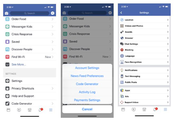
- You'll arrive at Facebook's Apps and Websites form. Tap on "Logged in with Facebook".
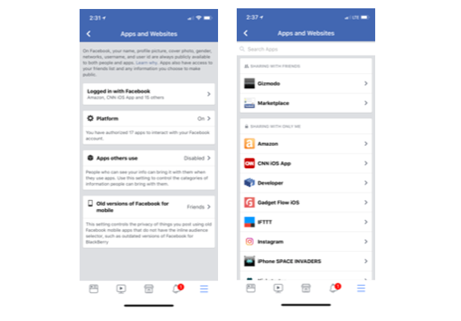
Spend a few moments taking this all in. This form is now separated into regions by sharing settings,
in increasing order of privacy. In other words, the group of apps that are shared only with
yourself are at the bottom, and the group of apps that are shared with the public are at the
top.
Just spend a few minutes surfing this Apps and Websites area and make certain you're good
with your settings, or change them. Different apps will request different data — some of them
will take absolutely everything they can get:
 In exchange for logging into this app with your
Facebook account, the app is collecting information on your friends, your posts, your likes,
your birthday, and more.
If you're not comfortable with the Facebook data
you are providing this third-party app, you can change those settings here. Personally, I've set
all of my apps and websites to share data with only me, and have limited the particular data to
my public profile and maybe my email address, but that's it.
Inspect Your Facebook Settings: Posts Privacy
When I think of "Facebook" and "privacy," the privacy of my posts is the first thing I
think of. In a time of change, a couple of years after I joined the network, I figured out
how to use Facebook's lists capability and came to use it exclusively, despite whatever
other controls Facebook introduced in the years since.
The key to the effectiveness of the list method is in your post security. You have to be
certain that the visibility of every post you make is restricted to your lists. That means
at least the posts you make from here on out, but could include modifying every post you've
ever made (as far back as your wall goes) if you want to be thorough. The choice is yours.
Imagine two lists, for the sake of simplicity. One is your "white list", with ALL of your
Facebook friends on it. The other is a "black list," for putting friends in "time out" on
occasion. Let's say you have a friend who has been getting particularly annoying of late —
maybe you've tired of her constant Candy Crush posts, or you're just done with the poltical
rancor he is spreading. Put them in the penalty box by adding them to your "black list."
Just make certain the privacy on your posts is set to only include the "white list", and
to specifically exclude the "black list." Doing this for all subsequent posts effectively
denies "black list" members visibility to anything you post (except for profile picture
changes) until they're off the "black list." If you chose to change the settings on all
of your previous posts, people in the penalty box will see none of your posts on your wall.

You'll likely have multiple lists. I do — life isn't as simple as black and
white (lists). The more lists you make, the greater the demand for maintenance. For example,
every new friend you take on must get assigned to a list with view permissions for them to
be able to see any of your posts on your wall. I started with a "white list," then branched
out. Some lists are confined to my neighborhood, and some are confined to family. I also
have a "children" list, so posts that aren't appropriate for younger eyes can exclude that
group. You get the idea.
Creating, populating, and maintaining lists is much easier using a PC browser than on a
mobile device. So log into Facebook on your browser, and look down the left side of your
News Feed for a heading called "Explore." Click on the item titled "Friend Lists." You may have
to click on "See More..." to reveal it.
You should land at this URL: https://www.facebook.com/bookmarks/lists/.
You can create and manage lists here. Clicking on an existing list will show your wall,
filtered to the list you clicked on — but you can see and manage the list's membership on
the right side either in the header or in a section titled "On this List".
The screen shot above is my actual "black list." There's currently one person on it,
and this list has been in existence for over ten years. Notice the list has zero access
to any of my posts on my wall. Toldja it's a penalty box!
I find it's much easier to manipulate the permissions of a single post using a
computer browser than to attempt it through a mobile app. I think the way to go is
to find a custom permissions set that will work well for most of your posts and to
revise permissions once posts are made, than to mess with the permissions prior to
creating the post. This is largely because a change in the permissions settings
before you make a post will be retained until you change it again.
Let's say you're going to post some pics for your motorcycle buddies. I find
it's better to leave permissions as they are, make the post, then edit the
permissions on that one post, than to edit the permissions at the start, make the
post, then have to change the permissions back to the way they were; particularly
if your standard custom set is complex or if you're posting from your mobile phone.
Think about it this way: using the latter method, you might easily change the
permissions to being only viewable by your motorcycle buddies list and make the post
from your phone; but if you forget to get onto your laptop later and correct the
custom permissions set, everything you post until you get it corrected will default
to go only to your motorcycle buddies list.
A few years after I started my list scheme, Facebook created several automated
lists, like "Family" and "Acquaintances" and so forth. The premise is exactly the
same -— consider these as "starter" lists. They'll require the same maintenance
as the lists you create.
Use Facebook's Privacy Checkup
Facebook has created a privacy checkup wizard. Apart from an appearance on your
wall from time to time, you can also access it from your iPhone by tapping the
Settings icon, then scrolling down to the SETTINGS region and tapping on the
Privacy Shortcuts menu item.
The Privacy Shortcuts screen is also where you can verify your posts settings
and even explore Facebook's data policy.
You Own Your Facebook Data
Remember that you can always request the data Facebook has on you. Log into
Facebook on your computer or phone's browser — not the app — then go to Settings.
The easiest way to do this is to click on the downward arrow at far right on the
blue banner at the top, then click "Settings." You'll land at the General Account
Settings. You'll see a series of rows of data — Name, Username, Contact, et cetera.
Below this is a link you might otherwise miss: it reads, "Download a copy of your
Facebook data."
Conclusion
- The Internet is forever. Be careful about who can see what you post.
- "If you don't want to pay with your data, you are welcome to make other choices."
- Check the permissions you've given to third party applications by using Facebook's authentication.
- Check the privacy of your posts. You can use lists if you've got the drive to see it through.
- Facebook has a Privacy Checkup wizard available for you to run at will.
- You can download a copy of your Facebook data at will.
Finally (if this hasn't been bad enough), check out this Twitter thread from Dylan Curran where he
reviews all of his data from Facebook and Google.
Link to this
Back to top
|
| 2018.03.18 |

Welp, this is silly.
A couple of weeks ago I had a period of a few days where seemingly everything I had
been working on achieved their desired end states. It was weird. And now I'm on the
downside of all of those achievements: I'm kinda left a little listless because I
finished it all.
Years ago I really wanted an HP LaserJet printer. A model was introduced that was
designed for the home or small office, and I really wanted it — but the price was
just too high for me. For well over a year I kept a close eye on the price — I'd
make a bee-line for the printers section whenever I walked into any technology store --
but the price never dropped. Then one day I got brave and looked online at eBay. There
I found them, new, in-box, for a better price than I was finding in retailers. So I
created an eBay account and bought one. For a long time after that, I'd just feel
lost when going into a technology retailer because the thing that had driven me to go
for so long wasn't a thing anymore. I remember stopping myself when I'd get to the
printers section and actually ask myself what I was doing — the search had become
habit, but now that the search was over, I just felt... empty. Listless. Wondering,
"Well, now what?"
Here I am feeling much the same, because so many different things all ended within
those two days. Major upgrade to my website is completed, in production, and I'm
really happy with it. I've had really good interviews with several potential employers.
I'd even finished Wolfenstein II and finally reached level 30 in
Pokémon GO!.
Now all that remains on the website work is some maintenance items; I have an offer
from one of those firms, and I've barely the motivation to even open the Pokémon
GO! app: Before, If I was driving by the local cemetery (a major location for
Pokéstops), I wouldn't have missed an opportunity to pull in, open the app, and
pick up some items or maybe join a raid. Lately, I can't be bothered. And it feels
really weird. I'm just so used to working so hard at it.
I guess I'll just await the next bit of "brain candy" to devour.
Link to this
Back to top
|
| 2018.02.14 |
I've been staying in a hotel for the past week. After two days here, I discovered
the key card to the room was erased. A couple of days later, I discovered both of the
key cards had stopped working, and had them reprogrammed by the front desk.
This was when I figured out I had been carrying my AirPods in their case
in the same pocket as the cards.
I don't seem to have any trouble with the room key when I don't have the
AirPods case with me.
I remember from my NEETS modules days that anything that generates an electrical
field also generates a magnetic field. The AirPods case is a small capsule that
acts as a charger for the AirPods, hence it generates electric and magnetic fields.
With the case and the key card in the same pocket, I can't help but wonder
if the magnetic field created by the AirPods case is at least partially erasing the
data recorded on the key card's magnetic strip.
Apparently, this is a thing.
I'll simply leave this here: If you're an AirPods user, consider carefully where you
carry the case in relation to things like key cards, bank cards and credit cards
which use magnetic strips.
UPDATE:
We're now in our third week at this hotel. I met a guy this morning at breakfast who was wearing AirPods and had
his case out on the table. I told him about my experience, and then showed him
the big dumb credit card case I bought as a defense against the constant card
erasure. Surprised, he admitted that he kept his room card and
the AirPods case in the same pocket (as had I). He thanked me for the advice and left after
a few minutes.
About ten minutes later he came back to our table and told me that his room
card wasn't working!
Link to this
Back to top
|
| 2017.12.31 |

Posts about fitness, family, geek stuff and national events dominated the interests posts in 2017.
| Topic | Count |
|---|
| books | 1 |
| cooking | 4 |
| family/kids | 34 |
| fitness | 45 |
| gaming | 7 |
| geek | 35 |
| leadership | 4 |
| movies | 2 |
| music | 10 |
| nation/politics | 24 |
Technically speaking, I did a lot on this website over 2017:
- Added a crawler atop the welcome page
- Made a cryptographic class
- Upgraded the professional section to include an interactive resume,
a reworked certificates and certifications form to include a coverflow-like
interface, and the introduction of a technologies list
- Implemented a major change to post favoriting to prevent records
from being overwritten by production pushes
- Numerous fixes and other minor enhancements
Link to this
Back to top
|
| 2017.12.27 |

We adopted two kittens from the shelter over a year ago. The male
has matured into just a bundle of love — I adore him. The female has
matured into a standard cat, who does not care one whit about people
and everything has to be done on her terms. As I said, a standard cat.
One can definitely tell the difference between the two cats when
they're around my laptop. The boy will very carefully walk around it
and other obstacles in... whatever he decides his path is. The female
simply can't be bothered, and will walk straight over the keyboard.
If you have a "keyboard cat" like I do, I've a software
suggestion for you.

PawSense is the brainchild of BitBoost Systems, which seeks to
solve the very problem of cats walking over your keyboard. PawSense
monitors keyboard input for values typically distinct from human
typing — cats' paws typically strike more than a single character
at a time — and locks the keyboard until a human unlocks it,
either by clicking in a particular spot or by typing specific
input.
PawSense likely runs as a service on your Windows computer,
monitoring the keyboard for unusual input. The software can play
a sound as an attempt to startle your visitor and to train her
(or him -— my bias) to keep off your keyboard.
PawSense is available for download for $19.99. BitBoost uses
Paypal to handle transactions. One word of advice: the download
form requires two inputs - one is associated with the name of the
purchaser, and the other is a purchase ID. That purchase ID is
displayed on a screen during the transaction, but it is not
included in the confirmation email coming from Paypal. Do yourself
a favor and copy down or take a screenshot of that purchase ID
while it's displayed on the screen so you'll have it when needed.
Otherwise you might find yourself e-mailing BitBoost support for
assistance (like I did) — and by the way, BitBoost support was
very responsive. I had reached out to them yesterday afternoon,
and had the fix waiting in my email this morning.
One more thing: PawSense was last updated to run on Windows 8,
though it's running fine on my Windows 10 machine.
Perhaps an unintended additional benefit of PawSense is that
it could make you a better typist. I've triggered the PawSense
software twice since typing this, telling me my accuracy could
improve.
Learn more about PawSense.
Link to this
Back to top
|
| 2017.12.22 |
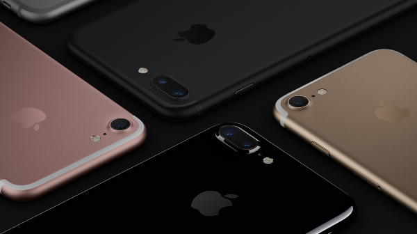
According to CNET reporting, Apple has released a statement this week
which verifies a long-held suspicion: Your older iPhone or iPad really
IS getting slower.
The statement was in response to an observation from Primate Labs.
Published in a blog post from its founder, Primate Labs' testing
showed that iPhone performance did not remain constant as the unit
ages, contrary to the public's expectations.
It's a Feature
Apple's response, reproduced here, was included in the CNET article:
"Our goal is to deliver the best experience for customers, which includes
overall performance and prolonging the life of their devices. Lithium-ion
batteries become less capable of supplying peak current demands when in
cold conditions, have a low battery charge or as they age over time, which
can result in the device unexpectedly shutting down to protect its
electronic components.
Last year we released a feature for iPhone 6, iPhone 6s and iPhone SE to
smooth out the instantaneous peaks only when needed to prevent the device
from unexpectedly shutting down during these conditions. We've now extended
that feature to iPhone 7 with iOS 11.2, and plan to add support for other
products in the future."
I admit, I'm in that camp — I've wondered why, after the release of a
a newer model, my iPad suddenly seems like someone replaced its chip
with a Pentium 60. My suspicion has been that AT&T had been throttling
it's network performance. Happily, I've never had a problem with a unit
(iPhone or iPad) simply shutting itself off. Thanks to this article, if
that happens, I'll know one reason why.
Read the full article.
Link to this
Back to top
|
| 2017.12.21 |
MICHIGAN NEWS, a publication of the University of Michigan, reported
their computer science department is working on a new computer hardware design
that moves information rapidly and randomly within the system, destroying the
data occupying the previous location. "The technology works to elude attackers
from the critical information they need to construct a succcessful attack."
Todd Austin, who leads Project MORPHEUS, offered this simile: "It's like if
you're solving a Rubik's Cube and every time you blink, I rearrange it."
Austin is excited about the program, because he believes the design offers a
solution that is "future-proof." The article argues that MORPHEUS could
protect against future threats, because zero-day attacks that focus on software
vulnerabilities require fixed locations of the vulnerability and the data. Under
MORPHEUS, the locations of everything — the vulerability, the data, passwords,
everything — would constantly be changing. In such an environment, vulnerabilities
won't matter, because an attacker would not have the time or resources to exploit
them.
Read the full article.
Link to this
Back to top
|
| 2017.12.20 |

I noticed the other day that my Windows machine went through a GIANT install —
on the order of the Fall Creators Update: installing a percentage of the update, then
restarting, then installing another percentage, then rebooting.
It turns out it actually was the Fall Creators Update — again. An update
to the update, if you will.
I watched a video that offered a summary of updates, and found one thing that seemed
useful to me directly: the ability to save a link right onto your taskbar.
Yeah, yeah, it had all kinds of other updates to Paint 3D and so on, but I don't
use those. I don't need them in my life right now. But I can get behind the URL thing.
Why? Because as it happens, I have a client for whom I'm doing a lot of work using
a Web form on a specific development server. It'd be nice to have a link to that URL
directly on the taskbar instead of having to open the browser, fight with it while it
tries to load the home page the client has set, to get to the dev box.
Luckily, Microsoft implemented a version of the feature in IE. If I was an Edge user,
I should see the feature shown in the video. The implementation in IE is a little
different. Under Options (the gear icon in the upper right corner) is an option titled
"Add site to Apps." After clicking, I found the shortcut (pictured as the Internet Explorer
"e" logo against a white background) right at the very top of my Start Menu (the first
entry under "Recently Added.") Right-clicking on the menu item gave me the option to
pin it to the taskbar.
You can go as far as view the properties of the shortcut from the taskbar, but
you can't edit the shortcut icon. Somewhat interesting: The shortcut is of a type called
"Pinned Site Shortcut" — not just "Shortcut."
I think it's a nice-to-have feature, because it keeps shortcuts off of my desktop
and down on the taskbar, where I live. One can create a shortcut on the desktop to an
internet URL, but about the best you could do to get it onto a taskbar in Windows 10
is to pin it to a browser taskbar icon. Not bad, but not quite as handy.
Link to this
Back to top
|
| 2017.12.16 |
Since the iPhone X was announced, Apple has marketed its
Face ID feature as purely a security enhancement, designed
to increase the security of the unit tenfold over its
earlier fingerprint ID technology.
But I believe Face ID's hidden purpose is to combat
distracted driving — or at least provide a mitigation
strategy for the company. Intentions aside, Apple has
made using an iPhone in a car significantly more
inconvenient than ever.
"1 out of every 4 car accidents
in the United States is caused by texting and driving.
Texting while driving is 6x more likely to cause an
accident than driving drunk."
Do Not Disturb While Driving
iOS 11 contains a key enhancement in this regard — its
Do Not Disturb While Driving feature activates automatically
by default when your phone connects to a Bluetooth system
in a car, or when you're traveling at a relatively high rate
of speed (determined through Location Services). While the
service is engaged, use of the phone is permissable only
after you signify that you're not driving — performed through
an extra tap on the phone's lock screen. Players of Niantic's
Pokemon Go! might recognize this from the game — if
location services detects that you're moving rapidly, the
game makes you acknowledge an "I'm a passenger" alert.
Face ID Demands Your Attention
Face ID completely ups the ante on Apple's anti-driving
campaign because, by default, Face ID requires you to look
directly at your phone before unlocking it (Apple calls this
"requiring attention"), and applies attention awareness to
other features, like dimming the phone's display. (See
Settings > Face ID & Passcode for the settings.)
The new unit also forces requirement of a passcode immediately,
without any other option or the possibility of disabling
the requirement (see Settings > Face ID & Passcode > Require
Passcode). What this essentially means is you can no
longer just unlock your phone, keep it in your lap and
casually use it in the car. The iPhone X
and iOS 11 demand you bring the phone up to your face to
unlock it, OR make you unlock it by typing in your code
if you're not using it continuously.
Cheap Sunglasses
Another note for mobile users (pun intended): Face ID
probably won't work if you're wearing sunglasses (it
doesn't work when I'm wearing mine). So now, in
addition to having to bring the unit up to your face and
to look right at it, you've also got to take off your
sunglasses.
Who wants to have to do all of that stuff from a car
seat?
"Apple has made using an iPhone in a car significantly more
inconvenient than ever."
Distracted Driving
So now I feel obligated to insert some data about
traffic fatalities related to distracted driving and
mobile phone use, to highlight the problem. To be
fair, the numbers are alarming. According to statistics
offered by a personal injury law firm, quoting the
National Safety Council, "1 out of every 4 car accidents
in the United States is caused by texting and driving.
Texting while driving is 6x more likely to cause an
accident than driving drunk."
1
With figures like these, it seems petty to argue whether
Apple is acting to protect consumers or to protect itself.
Besides, one could also argue that Apple is incentivized to
make these changes to their products to keep people alive so
they can buy more of their products — or, in the case of
younger consumers, appeal to their parents. (Cell phone use is highest
among 16 - 24 year olds.)
2
I'm not saying these things to act in poor taste; I'm
merely exploring Apple's rationale for making the changes
I'm griping about.
Not Yet Sure How I Feel About It
Yes, this makes me one of the 660,000 guilty of using a
mobile phone in some way while in a car. I also wrote some
software called "AUTOreply" several years ago for my Android
phone because I was tired of constant text messages while I
was driving.
Typically if I'm using the phone, I'm answering it over the
car's stereo in a hands-free way. Sometimes, I make calls, too
— and Apple's now made it really difficult for me to do that,
because dictation doesn't work well through my older car's
system (hmm.... are they trying to boost sales of CarPlay-equipped
units too?) I'm still against texting.
The design changes of the iPhone X absolutely discourage
any active use of the unit while driving or even just being
in a car, and for good reason.
Over time, I'm sure I'll get used to them; right
now, I guess I'm too familiar with the relative convenience
my 7 Plus offered, and find myself wanting it back.
UPDATE: There is one setting change you can make to
make your life a little easier. I found it after I'd published
the original article (of course). You can modify the Auto-Lock
setting to give you a little breathing room. Find it under
Settings > General > Display and Brightness, at about
the middle of the screen. I believe my machine was set to
30 Seconds as a default. Set that value to something higher
to give yourself a little more time before having to reverify
your identity to your phone again.
Link to this
Back to top
|
| 2017.12.14 |

We've tickets to the first showing of The Last Jedi in just a couple of hours.
OMG OMG OMG OMG OMG OMG OMG OMG OMG OMG OMG
Link to this
Back to top
|
| 2017.12.06 |

Since the iPhone X was announced, Apple has marketed its
Face ID feature as purely a security enhancement, designed
to increase the security of the unit tenfold over its
earlier fingerprint ID technology.
But I believe Face ID's hidden purpose is to combat
distracted driving — or at least provide a mitigation
strategy for the company. Intentions aside, Apple has
made using an iPhone in a car significantly more
inconvenient than ever.
"1 out of every 4 car accidents
in the United States is caused by texting and driving.
Texting while driving is 6x more likely to cause an
accident than driving drunk."
Do Not Disturb While Driving
iOS 11 contains a key enhancement in this regard — its
Do Not Disturb While Driving feature activates automatically
by default when your phone connects to a Bluetooth system
in a car, or when you're traveling at a relatively high rate
of speed (determined through Location Services). While the
service is engaged, use of the phone is permissable only
after you signify that you're not driving — performed through
an extra tap on the phone's lock screen. Players of Niantic's
Pokemon Go! might recognize this from the game — if
location services detects that you're moving rapidly, the
game makes you acknowledge an "I'm a passenger" alert.
Face ID Demands Your Attention
Face ID completely ups the ante on Apple's anti-driving
campaign because, by default, Face ID requires you to look
directly at your phone before unlocking it (Apple calls this
"requiring attention"), and applies attention awareness to
other features, like dimming the phone's display. (See
Settings > Face ID & Passcode for the settings.)
The new unit also forces requirement of a passcode immediately,
without any other option or the possibility of disabling
the requirement (see Settings > Face ID & Passcode > Require
Passcode). What this essentially means is you can no
longer just unlock your phone, keep it in your lap and
casually use it in the car. The iPhone X
and iOS 11 demand you bring the phone up to your face to
unlock it, OR make you unlock it by typing in your code
if you're not using it continuously.
Cheap Sunglasses
Another note for mobile users (pun intended): Face ID
probably won't work if you're wearing sunglasses (it
doesn't work when I'm wearing mine). So now, in
addition to having to bring the unit up to your face and
to look right at it, you've also got to take off your
sunglasses.
Who wants to have to do all of that stuff from a car
seat?
"Apple has made using an iPhone in a car significantly more
inconvenient than ever."
Distracted Driving
So now I feel obligated to insert some data about
traffic fatalities related to distracted driving and
mobile phone use, to highlight the problem. To be
fair, the numbers are alarming. According to statistics
offered by a personal injury law firm, quoting the
National Safety Council, "1 out of every 4 car accidents
in the United States is caused by texting and driving.
Texting while driving is 6x more likely to cause an
accident than driving drunk."
1
With figures like these, it seems petty to argue whether
Apple is acting to protect consumers or to protect itself.
Besides, one could also argue that Apple is incentivized to
make these changes to their products to keep people alive so
they can buy more of their products — or, in the case of
younger consumers, appeal to their parents. (Cell phone use is highest
among 16 - 24 year olds.)
2
I'm not saying these things to act in poor taste; I'm
merely exploring Apple's rationale for making the changes
I'm griping about.
Not Yet Sure How I Feel About It
Yes, this makes me one of the 660,000 guilty of using a
mobile phone in some way while in a car. I also wrote some
software called "AUTOreply" several years ago for my Android
phone because I was tired of constant text messages while I
was driving.
Typically if I'm using the phone, I'm answering it over the
car's stereo in a hands-free way. Sometimes, I make calls, too
— and Apple's now made it really difficult for me to do that,
because dictation doesn't work well through my older car's
system (hmm.... are they trying to boost sales of CarPlay-equipped
units too?) I'm still against texting.
The design changes of the iPhone X absolutely discourage
any active use of the unit while driving or even just being
in a car, and for good reason.
Over time, I'm sure I'll get used to them; right
now, I guess I'm too familiar with the relative convenience
my 7 Plus offered, and find myself wanting it back.
Link to this
Back to top
|
| 2017.12.03 |
Citizen's Eco-Drive Proximity line is a series of watches that are designed
to be semi-smart, in that they tie in with your smartphone to provide some
very nice functionality. For example, syncing with your phone means never
having to set your watch manually again. The best use of this that I can think
of is when you're flying across time zones — a touch of a button and your
watch is set to the correct time. It's also able to alert you when you receive
new e-mails and when your phone goes out of range (e.g., you've left it
someplace). Syncing with your smartphone obviously requires a smartphone app. The
application communicates with the watch over a Bluetooth connection.
I received mine as a gift several years ago and loved it. It's spent the
last couple of years on the shelf with my other dress watches because I
favored my Apple Watch. But since I dropped it and smashed the screen, I'm
back to my other watches again.
I downloaded the Citizen Proximity app onto my new phone (running iOS 11)
and couldn't get the watch to connect, so I contacted Citizen support.
Some three weeks later, I received a reply, which basically told me
that my watch — the W760 — is obsolete, compatible with iOS versions
up to 9 (two major versions ago). The more recent W770 models are still
compatible with the current operating system.
I have a problem with having only some percentage of its functionality
available because the watch won't sync anymore. So I replied, asking if
Citizen is doing anything to upgrade the W760 owners to a W770. Who knows
when I'll receive a reply -— with the holidays coming, I might not get
a reply until sometime in January.
Link to this
Back to top
|
| 2017.11.08 |

GIZMODO reports a newbie developer has found himself in the center of a "perfect
storm" of bad moves and bugs that caused him to take "possession of an estimated
$300 million worth of the Ethereum cryptocurrency by accident. In an attempt to
give back the money, however, the poor guy ended up locking up the funds permanently.
In effect, that money is just gone."
Read the full article here.
Link to this
Back to top
|
| 2017.10.31 |

Just wanted to say that
this guidance proided by PCWorld
is still useful to me, a Firefox user. I've referred to their instructions two
or three times since I posted about it back in mid-April.
If you're a Chrome, Firefox, or Opera user, this post will step you through
how to rid yourself of the annoyance.
Link to this
Back to top
|
| 2017.10.29 |

I really enjoyed Jon Patrick Pullen's article in Time Magazine,
"Forget the iPhone X, Apple's Best Product
Is Something You Can't Buy".
Pullen favors Apple's privacy policy
and practices above those of competitors like Google and Amazon,
based in part on the companies' business models. I like Pullen's
approach here: if user data is a revenue stream, it follows that
users' privacy cannot be a primary concern for that company:
Google, by contrast, not only sells phones and other devices,
but also makes money off the ads (and the user data) that
appear on those handsets, laptops and tablets. Amazon's
gadget-oriented business model wants to sell you things...
that will help sell you more things.... Facebook's users...
are themselves the products unwittingly feeding the social
network's revenue model.
I take issue with one point Pullen made, which was
to partially blame Apple for the successes of a 2014 phishing
campaign that led to the leaks of celebrities' embarrassing
personal photos. It's wrong to hold Apple responsible for
that. Google or Apple or Slappy's Online Fish Market could
encrypt and secure absolutely everything related to users' data,
but if the user surrenders their means of accessing it — maybe
the ONLY way to access the data in decrypted form (passwords,
physical keys, fingerprints, or whatever) — that's not the
company's fault. That's like blaming Ford for the theft of your
car because you gave a stranger your keys.
The article is worth the few minutes to read, because
it encourages one to think about the companies behind the
data storage. The author notes the privacy policy and protections
add to the value proposition of Apple's products — even the
$1,000 iPhone X — and subtly reminds us there's always
a catch.
Link to this
Back to top
|
| 2017.10.02 |
Apple has already released a patch for iOS 11.
Version 11.0.1 was on the street this past weekend. Intended to
correct
a problem some were having with e-mail, 11.0.1 is apparently
presenting problems for some iPhone 6 users.
Link to this
Back to top
|
| 2017.09.21 |

I upgraded the iTunes application on my laptop, my iPhone to
OS 11 and my Apple Watch to WatchOS 4 yesterday.
Upgrading iTunes
The biggest thing to watch out for in the iTunes upgrade is
that apps are no longer handled through iTunes. iTunes is now
for media content only. That's going to take some getting used
to. Also, sort of iTunes related, you can now restore your your
ringtones directly on the phone. This is a huge benefit also to
the AppleCare people who support iTunes — in the past, users
had to call into AppleCare to have them unlocked.
Upgrading to iOS 11
My upgrade to iOS 11 went very smoothly, and I have not
experienced the slowness that others have. This may be, in
part, because I'm an Apple Music subscriber, which has
eliminated the need to have music downloaded directly to the
unit. The result is substantially fewer files stored on the
phone, which means I have more than half of my space
available. My surmise (read: I might be talking out of
my tailpipe here) is that the relatively low number of objects
(photos, music files, etc.) and the large percentage of unused
space gave the OS plenty of room to index relatively few
objects.
I've seen a few nice changes to the interface. I'm sure there
are more I haven't yet discovered. Perhaps the most obvious of
these is that they've taken the UI for Apple Music and applied
it through their entire ecosystem, giving a uniform look to the
other iOS apps (that is, the other Apple apps). Also, the control
center has been revamped — swipe up from the bottom to check it
out. Other smaller touches: Screenshots now produce a miniaturized
image of the screenshot at the bottom left of the screen — more
than just a nice little reinforcement that you got the screenshot;
touching the miniaturized image drops you straight into editing
tools, and even lets you delete the 'shot. And speaking of images,
iOS 11's Photos app now displays animated gifs, and includes the
capability to create an Apple Watch face directly from the menu,
just like you can with wallpapers for your device. Another nice
touch is in the Activity app — you can look in the history of
your workouts now and see a graph of your heart rate (heart rate
was a topic of discussion at the unveiling).
Apple has also introduced a new safety feature on the phone.
If you connect your iPhone to your car's audio system (I do this
via Bluetooth), the phone will now restrict what data you get back
from Siri, will intercept texts you receive and reply that you're
driving, and will make you attest that you're not driving if you
attempt to access the device. I believe this can be overridden
someplace in settings, but I haven't looked into how yet.
Apple has also made a few subtle statements with the new OS
release. For example, the Contacts app icon now depicts silhouettes
of male and female figures (before it was a silhouette of a person
— I never really assigned it a gender). Another example is in the
wallpapers included with the new system there are several still
wallpapers which feature solid lines in multiple colors that appear
similar to, though not quite reproducing, the pride flag.
iOS 11 is a much bigger deal for iPad. The change in the control
center is far more pronounced on the iPad than it is on the iPhone.
My iPad Air 2 has a couple of years on it, but I really don't use
it for a whole lot. So I'm uncertain how the upgrade will impact
my use.
Upgrading to WatchOS 4
The upgrade seemed to take forever. I chalk this up to a
combination of demand and the fact that I was upgrading a first
generation Apple Watch.
WatchOS 4 comes with a few new faces, but some other nice
enhancements — starting with the lock screen: the numbers and keys
are larger and easier to read.
But I'm annoyed with another enhancement — when I play music
on my iPhone, the watch shows that the phone is playing music. (Tap
the crown to close that to get back to your watch face.) Hint: I
don't need that information. Really. I listen to music all day
long. I'd rather not have to close the stupid music app every time
I look at my watch. To fix this, open the Apple
Watch app on your phone and navigate to General,
then scroll down to Wake Screen. Toggle "Auto-launch
Audio apps" to OFF. Now when you play music, the
iTunes app won't automatically launch, and you'll see your watch
face when you raise your wrist.
Link to this
Back to top
|
| 2017.09.20 |

Early reporting from
BGR.com suggests that,
while any OS upgrade
will slow all phones down temporarily while objects get re-indexed,
some iPhone users, especially those with the iPhone 6 and 6 Plus, have
reported lasting battery life effects. These users have been running iOS 11
since last week, when the Gold Master was released.
The author suggests users might try throttling back background refresh and
location access settings:
If you experience faster battery drain after updating to iOS 11, there
are a few things you can do to potentially extend your battery life.
The two big ones are limiting the number of apps that can refresh in
the background (Settings > General > Background App Refresh) and
limiting the number of apps that can access your location in the
background (Settings > Privacy > Location Services). If that doesn’t
have much of an impact, Low Power Mode may become your best friend
until Apple pushes out new updates in the coming months that will
hopefully address excessive battery drain.
The author also wrote a
separate article with
additional information on how to lighten the load on your device.
Link to this
Back to top
|
| 2017.09.20 |

My wife has already upgraded both her iPad Air 2 and iPhone 7 Plus
to the new operating system, and is currently installing the watchOS
upgrade onto her first generation Apple Watch. I have exactly the same kit,
but have done none of this so far, partly because it hasn't been on my radar,
partly because I doubt I'd have made the time to do it even if it was,
but also partly because I haven't yet been overtaken by the potential
coolness and anticipation.
But I'm also putting off the upgrade until I have another task
completed: clearing the clutter of old photos off of the phone.
I have the Microsoft OneDrive app on my iPhone. It's there really for
one reason: to make backups of all of the photos I take. Now, you might
say, "Well, you already have backups of all of your photos in iCloud."
True. But here's the rub: deleting photos from my phone also deletes them
from iCloud. Actually, deletes them from all of my Apple Devices AND
from iCloud. So thumbing through the All Photos album means I have to see
every. single. picture. Some of these, I just want archived in a way where
I can forget about them. I'm not saying they're unimportant photos; I'm
just saying that I don't need to scroll through the 200 images of Papa's
birthday celebration every time I'm looking for a particular image.
The OneDrive app has a feature called Camera Upload, and it does exactly
what you'd expect: grabs all of the images off of the camera roll that
aren't already uploaded to OneDrive and pushes them up. Once done, they're
away from iCloud and the iPhone, and I can prune the photos on the phone
to my heart's content.
I could keep the Camera Upload feature on all of the time, but that
would mean that every photo I took would get uploaded in near real-time.
I prefer instead to keep the feature turned off and do some rudimentary
culling first to clear out junk like images I download for one-time use.
Images like those don't really have any meaning beyond, say, the context
of a conversation, so I don't feel the need to persist them anywhere.
So every couple of months I'll go through my photos, delete the ones
that can be deleted, then fire up OneDrive and activate Camera Upload.
Once the images are done being copied, I'll shut Camera Upload off again.
Copying and culling photos like this is a great way to cut down on
the number of objects getting indexed by the OS. The indexing supports
Spotlight search, making searching for specific objects super fast.
Major OS releases (like iOS 11) always reindex EVERYTHING at first — all of
your contacts, all of your photos, and so on, and it takes time and power
to redo the entire index. And by power, I mean
battery life.
Link to this
Back to top
|
| 2017.08.07 |

I could swear this used to be easy.
I've found a song that I want playing over and over and over again
while I work. It's beautiful, melodious, and would be perfect background
noise while I do my nerd thing. But I couldn't find where to set the
repeat or shuffle command ANYPLACE within the music app on my iPhone.
Every time I'd look at the song's "context menu," I saw options to add
to a playlist, play next, play later, and sharing and liking options,
but nothing for simply triggering a repeat or shuffle.
Well, turns out I couldn't find it because it's not in the music app
at all. To get to these options, you have to use the little control menu
that has options for airplane mode, WiFi, Bluetooth and so on at the
bottom of your screen. Swipe up from the bottom of the screen to access
the menu.
The first form has the options I mentioned earlier across the
top, and access to the flashlight, timer, calculator and camera across
the bottom. Swipe left to access the second form, which is dedicated to
music player controls.
This second form shows the album cover art at left, with text at
right, starting with the name of the current track. Tap on the track
name to bring up info about the track in a full-length form.
Now scroll up on that form to reveal the shuffle and repeat buttons.
Link to this
Back to top
|
| 2017.08.06 |

In all the years I've owned iPhone models, only once have I had to replace a
cracked screen. And that day was yesterday.
This post is not about how one performs a screen replacement; it's about what
to expect when you take it to an Apple Store to get the screen replaced.
A couple of weeks ago, my unprotected iPhone slid out of my pocket, out of my
car, and hit the concrete driveway, leaving a crack in the screen resembling a
dog-ear on a paper page, and a few pits in the metal at the impact point. The unit
was still usable, but I knew the crack was an unsafe condition at the very least.
Besides, this kind of thing is what AppleCare is FOR.
Our nearest Apple Store is about an hour and a half away. They didn't have any
appointments available for the coming weekend, so our next shot was the weekend
after that.
Upon arrival, the Apple people made things as easy as possible for me, but
there were a few surprises. They ran a diagnostic to ensure the unit didn't have
additional damage, then had me check and disable a few things in Settings, like
you would if you were replacing the unit. Replacing the unit was an option, but it
would cost $99 as opposed to the $29 cost for just replacing the screen.
Now might be a good time to talk about the Find My iPhone feature. It's one of
the things I had to disable when I brought the unit in for repair. Find My iPhone
was repurposed as a theft deterrent in response to a wave of iPhone thefts a few
OS versions ago. The feature now prevents the unit from being accessed or restored
over by anyone other than you. In the case of repairs, the Apple Store technicians
need this turned off in order to work on your phone; in the case of buying a new
phone, it needs to be turned off to allow the information on your current phone
to be erased.
The surprise part was that I had to leave the phone at the Apple Store for two
hours while the repair was effected. And, when the phone was returned to me, I was
told the Home button sensor was also replaced as a matter of SOP — understandable
considering it's attached to the glass — but the notion of resampling all of the
fingerprints I had stored was a bit annoying.
Touch ID is the phone's ability to identify an authorized user by fingerprint.
Originally implemented as a security convenience for access to the phone, Apple
extended the API to programmers to allow their apps to take advantage of it. It
is implemented through the Home button — the only button on the face of the
iPhone. So replacement of the Home button also meant replacement of the Touch ID
mechanism. After "surgery," I found that some of my apps continued to respond to
Touch ID as if nothing happened; but in at least one case, Touch ID was disabled,
meaning I had to go into the app's settings and re-enable it. Your mileage may
vary, but keep in mind that some of your apps may have disabled their Touch ID
capability after the Home button was replaced.
So, if you find yourself in this situation, you can expect:
- to be able to easily make an appointment with the Apple Store by using the Apple
Support app. Download it from iTunes. The icon is blue with a white apple logo in
the upper right corner, resembling the tee shirts the Genius Bar people wear.
- to be asked to back up your phone before you visit the Apple Store
- the technician will verify the serial number on the unit and verify that you
backed up the phone
- you will be directed to disable the Find My iPhone feature. You'll have to
enter your iCloud password to do that.
- your phone will spend a little time in surgery. In my case, it was two hours.
- you will be directed to log into your phone (Touch ID will not work.)
- you will be advised that you'll have to re-enable Find My iPhone and Touch ID.
- you may need to re-enable Touch ID on some of your applications.
- you will see they did a beautiful job.
Link to this
Back to top
|
| 2017.07.29 |

I was just at the gas station, and put air in three of the four tires on my car
(I couldn't get the air hose to reach the right rear tire). The mobile app I have from
the manufacturer is incorrectly reporting the tire pressures on the car — it says the
tire I couldn't reach is now up to spec, and one of the tires I could reach is still
below spec.
Because I'm a good guy, I'm working to contact the app developers to let them know
they may have their wiring mixed up with regard to the air pressure reporting — I
believe they've got the right rear data being reported in the right front, and visa
versa.
So I'm on a call with OnStar and she's telling me I'm receiving the data incorrectly
because I don't use the app often enough.
Now I have to weigh the cost of staying on the phone with this script-bound kid, who
insists on sending data to my car, against the velue of getting the message to the app
developers.
It's becoming a question of how badly I want to help — whether it's worth
enduring their procedures and diagnostics. All I really wanted to do was shoot
OnStar a quick e-mail.
Link to this
Back to top
|
| 2017.07.25 |

After both the May and June cumulative updates failed to install, the laptop found something about
the July update it liked, and now the laptop is up-to-date.
I'm so happy this case is closed. The laptop is back home where it belongs, with a whole lot more
RAM and, more importantly, it's not trying to choke down a GIG worth of data anymore every time the
laptop boots.
I confessed to the HP support people that I was shopping around for somebody to reload the whole
laptop and do all the updates — what I found was expensive: $120 to $150 for a complete reinstall
with all of the updates. Had the price been more reasonable, I might have jumped on it — I'm glad
now that I didn't.
Read previous info for this post.
Link to this
Back to top
|
| 2017.07.12 |

Left your Apple Watch's Activity app running after your workout? Use your iPhone's Activity and Health Apps to delete bogus workout data
Never stop learning.
I recently learned that there is an "Other" type of workout available on the Apple Watch.
If you set this to "Open", you've basically got the watch recording everything you're doing. It's great for
limited use stuff like a busy morning routine — going downstairs, making the coffee, letting the dogs outside,
going into the basement to get the dehumidifier pail, coming back upstairs to dump it, then going back
downstairs to place the empty pail back in the machine, then back upstairs to the main floor... you get
the idea.
One runs into problems when the activity is left to record once all that movement is done. This morning,
I engaged the "Open/Other" activity to do a bunch of things downstairs before returning to work, and
failed to shut it off — it ran the entire time I was taking a training course — for over an hour.
After the course, I went outside to start my morning exercise, and saw my activity ring had 82 minutes
recorded to it. Oops.
Here's what I did to resolve it, though be warned: You'll lose all of the data for the "bogus" workout.
So if you actually exercised for 10 minutes and then sat on your behind for 60, you'll lose credit for all
70 — the good 10 minutes plus the rest. If you're okay with that, follow these steps. If you're not,
read through and maybe you can figure out a better way to do business.
- I opened the Activity app on my phone.
- The History panel is selected by default, and the view is the current day. I scrolled down to
the Workouts list and found two actual workouts and the bogus one.
- I opened the bogus workout and noted the time range.
- Then I went back to the list of today's workouts and deleted the bogus workout.
(Yes, I lost credit for the actual workout part, but I figured that was a small price to pay.) The move ring data reset immediately, but the activity ring data did not.
- Then I opened the Health App.
- On the Health Data panel, I tapped on the large orange Activity icon at top left.
- I scrolled down the list of data to and tapped on Exercise Minutes.
- I tapped on Show All Data.
- I tapped on the row with the current date.
- Every minute that has recorded data shows a "1", followed by the time down to the minute.
These rows are sorted in descending order, such that the most recent minute is at the top.
For each row in the time range I noted earlier, I swiped left to expose a delete button, and
tapped the delete button.
- After clearing out each of the entries, I backed out two or three times to the Exercise Minutes panel
to ensure the data saved.
- The activity ring data on my watch reset.
I'm not saying this is necessarily the BEST way to handle this. I'm simply sharing what I did
to get my data back in line with my actual activity, albeit I did it at the cost of the 10 actual
minutes of workout data in my "70-minute workout."
Perhaps I could have done more in the Health app to whack the calories in the Exercise Minutes
I deleted. I simply don't know. But what I did got me far closer to actual effort than leaving it be.
Link to this
Back to top
|
| 2017.06.30 |

"I figured that since the Health app also takes input from some measurements on the iPhone,
some percentage of the workout could be retained, like distance. In short, NOPE."
Because there seems to be so muh redundancy between the Apple Watch and the iPhone,
I wondered what would happen to your workout recording if the Apple Watch battery expired
during a workout.
Well, last night I found out.
I had never had any challenges with battery life with the Apple Watch v1 until I started
using its workout features. I've progressed to the point where I close the activity rings
every day — that's a stand goal, a move goal, and an exercise goal.
I believe the Apple Watch collects all of this data and it gets recorded by your iPhone
in the Health app, then read from the Health app by the Activity app. Particularly during a
workout, the Apple Watch is very busy recording. Data surfaced through the Activity app
includes two flavors of calorie burn, average heart rate, the weather at the time, and
elevation gains. So it should be of little surprise that all of this data collection can
be demanding on the power source, and that longer workouts will mean greater drain.
I've become used to seeing my Apple Watch report battery levels under 10% by the evening.
Last night we walked about a mile to get Laurel caught up on her workout — it had
rained earlier in the morning, precluding us from following our normal routine. At the time
we left, my battery level was at 3%. There was no way it was going to hang on for longer
than a couple blocks. Still, I figured that since the Health app also takes input from
some measurements on the iPhone itself, some percentage of the workout could be retained,
like distance.
In short, NOPE. Last night when I got home I saw no record at all of the partial workout.
It wasn't showing on my rings, it wasn't showing in the Activity app — it was like nothing
had happened. This morning after powering the Apple Watch back up, the data from the workout
up until the watch died was resident in the Activity app. The map shows the precise location
where the battery gave up, and all of the workout data accounts for only that percentage of
the workout — meaning the record I have shows that I worked out for 4 minutes and a distance
of 0.23mi, burning 21 calories.
Now, the Activity app also shows your total number of steps, though not measured by
workout. That data appears low when compared with the steps shown on my Stridekick app —
just under 8,000 compared to almost 9,500. I don't have an Apple Watch app for Stridekick.
That tells me the Activity app could be ignoring the iPhone data in favor of the Apple Watch
data. But when I examine the data sources for steps in the Health app, both the Apple Watch
and the iPhone are listed.
I'll reach out to Apple Support on this and report back with their response.
Link to this
Back to top
|
| 2017.06.21 |

"Autofill can insert your personal information into multiple controls at once, like filling out
an entire address form for you as a convenience. NaviStone's code can snatch it up and send it
as each field is filled."
GIZMODO reported on a company called NaviStone
with code that gets embedded in clients' ecommerce sites. NaviStone's code collects and
transmits the data you're providing regardless of whether you
actually perform the transaction.
During a recent investigation into how a drug-trial
recruitment company called Acurian Health tracks down people who look online for information
about their medical conditions, we discovered NaviStone’s code on sites run by Acurian, Quicken
Loans, a continuing education center, a clothing store for plus-sized women, and a host of other
retailers. Using Javascript, those sites were transmitting information from people as soon as
they typed or auto-filled it into an online form. That way, the company would have it even if
those people immediately changed their minds and closed the page.
The GIZMODO report further explains that while the NaviStone technology is giving retailers
the option to collect your data in real-time, whether the retailers opt to take advantage of
the collection capability could come down to policy. My interpretation: There may be a distinction
between NaviStone's collection and what portion of it the retailer is interested in. (Just because
the retailer doesn't want particular data until you submit the form doesn't mean the software
isn't collecting it in real-time anyway.
GIZMODO also claims that NaviStone changed their collection policy as a result of the GIZMODO
investigation:
[GIZMODO] decided to test how the code works by pretending to shop on sites that use it and
then browsing away without finalizing the purchase. Three sites—hardware site Rockler.com,
gift site CollectionsEtc.com, and clothing site BostonProper.com—sent us emails about items
we’d left in our shopping carts using the email addresses we’d typed onto the site but had
not formally submitted. Although Gizmodo was able to see the email address information being
sent to Navistone, the company said that it was not responsible for those emails.
. . . As a result of our reporting, though, NaviStone says it will no longer collect
email addresses from people this way. "While we believe our technology has been
appropriately used, we have decided to change the system operation such that email addresses
are not captured until the visitor hits the 'submit' button," [NaviStone COO Allen] Abbott
wrote.
I may have some personal experience with this. I was browsing the web store for the band STYX
some time ago and abandoned the transaction. I received several e-mails from the site, reminding
me that I'd left items in my cart.
The NaviStone technology is not necessarily ground-breaking — JavaScript's ability to execute
in the browser client is a cornerstone of the modern Web — but using it to report data
prior to submitting the form is, at the very least, a betrayal of netizens' trust. (An expert
GIZMODO contacted on this very topic concluded that a legal complaint could be viable.) And it
is reporting the data — it's encoding it as a file and sending it each time the value of a form
control gets changed, like a textbox getting filled in or a selection is made in a dropdownlist.
See the GIZMODO article for the illustrated play-by-play.
This application of client-side technology could have some serious ramifications for the autofill
capability in your browser. Autofill can insert your personal information into multiple controls
at once, like filling out an entire address form for you as a convenience. NaviStone's code
can snatch it up and send it as each field is filled.
This might sound a bit alarmist, but consider disabling the feature
in your browser, or at the very least, think twice before allowing it to run on unfamiliar sites.
Link to this
Back to top
|
| 2017.06.04 |

I've a family member who was complaining of her laptop running extremely slowly. Her laptop is an
inexpensive HP unit with 4GB RAM. So the first thing I did was goose it with 8 additional gig. But
then I dug a little deeper and found that the hard drive activity was maxing out immediately and staying
pegged for about 10 minutes or so. Between the hard drive activity and the low RAM, no wonder she
felt like she couldn't do anything when she booted up.
I found that a cumulative Windows update from early May keeps getting stuck and not installing. It's a huge
update — like 1GB. Walking through the issue with HP technicians, I monitored several logs in the
Windows Event Viewer during an install attempt and found the root of the problem documented in
CBS.log: the update code gets hashed and compared with a hash value someplace in sxs, and one part
failed the comparison. The log seems to infer that the automagic fix for this is to repair a corruption
in the component store (which is sxs) — that also seems to be the go-to solution for the HP technicians
— but DISM consistently reports there's nothing to repair, and the repair effort always reports nothing found,
nothing fixed.
If there's a hash for these updates someplace in the component store, then that means the value gets put there
somehow. My guess is the store is fine, but either the hash in sxs is bad, OR there's a problem with the
file Windows Update is pulling down. Let's discuss: - In the latter case, if the hash that sxs
is organically bad, the update should fail on ALL clients, not just mom's — and it installed fine
on my laptop. So maybe that value got munched somehow in transmission to mom's laptop.
- In the former case, it's failing to stage one particular packet — not ALL packets. Clearing the WU
download directory and redownloading is having no effect (as is everything else the HP technician is asking
me to do — but I understand s/he's likely following a script).
I think I need to get smarter on the relationship between the component store (sxs) and Windows Update.
In the meantime, I'm going off-script: I've cracked open a copy I made of the CBS.log and started Googling.
I've found a post from Microsoft which includes a series of steps — many of them I've already done as part
of troubleshooting before engaging HP or as part of the HP troubleshooting... some aren't. I figure I
can include the results in my next post to HP Support.
UPDATE:
I thought I had it licked: Critical analysis of CBS.log gave me crucial clues. The part that was failing
was a file that included major, minor, build and revision numbers that seemed to match the Windows OS. Googling
those numbers led me directly to a patch Microsoft had released in April — the KB number for that release
was not among the updates installed on that PC. So my path was to install this missing update, then reattempt
to install the problematic May update. The instal failed, but the message in the Setup log was far more
direct than the Setup log messages I receive for the failed May update attempts. Perhaps that's something.
Link to this
Back to top
|
| 2017.05.30 |

My laptop downloaded and installed the Windows 10 Creator's Update yesterday evening, and this morning
my laptop said, "What printer?"
On my network, that printer has it's own dedicated IP address. There's no reason whatsoever for
this laptop to not be able to see that printer.
UNLESS you're a printer driver killin' Windows update. I was able to remove the multifunction device
and reinstall it to Windows pretty easily. As with most Windows troubleshooting things, identifying the
problem takes way longer than it does to correct it.
Link to this
Back to top
|
| 2017.04.14 |

Probably related to my annoyance with Edge's jealousy in Windows 10 is my annoyance with
videos that start playing in my browser on page load. SERIOUSLY annoying.
If you feel the same, check out this article from PC World.
If you're a Chrome, Firefox, or Opera user, this post will step you through
how to rid yourself of the annoyance. If you're a Microsoft or Safari user, this
article, dated September, 2016, won't do you a whole lot of good. Hopefully
these vendors have since developed another way to get you where you want to be. If I can find solutions for Microsoft and Apple browsers, I will update this post.
Link to this
Back to top
|
| 2017.04.05 |

Sent this e-mail to support this morning. Thought I'd share with my nerdlicious friends:
"I do appreciate the nod to Douglas Adams in the default assignment of Number types to a value of 42.
Fortunately, explicitly setting such a variable to zero before using it will prevent your calculations from including the Answer to the Ultimate Question of Life, the Universe, and Everything.
I found this when writing a workflow that involved time duration calculations (summing the durations of calendar events).
Upon storing the sum in a variable, I found the value was being converted to a Number (as seconds) in the variable, plus a special surprise: every calculation I was making was somehow getting an extra 42 seconds tacked onto it.
The calculations were corrected once I explicitly assigned a value of 0 to the variable at the top of the workflow.
I’m hoping you might consider adjusting the app to correct for this. After all, 7.5 million years is a long gestation period for a bug."
Link to this
Back to top
|
| 2017.03.07 |

Dear all the connected things in my home:
S.
T.
F.
U.
Tornado. Right. I get it.
Link to this
Back to top
|
| 2017.02.26 |
Windows 10 users may have noticed on the taskbar a strange icon
their desktop taskbar that appears to be a square overlaid atop a rectangle. (Apple iTunes
users might find the icon vaguely reminiscent of
Cover Flow.)
Perhaps only few recognize the icon for what it actually reprepsents: The key to
greatly enhanced productivity. This Task View icon creates additional instances of your Windows desktop,
and allows you to navigate among them. I started using this a couple of weeks ago and absolutely
love it.
Laptops are great for portability, but, particularly when you're working on the road,
one can't always plug into external monitors. With such limited screen real estate, it's
hard to work with all of your windows open, or even minimized to the taskbar. With
multiple desktops, one doesn't have to — all the e-mail and calendar windows can be open
on one desktop, and that spreadsheet can be open another, and that other software you have
to have up all the time can be on another. Keyboard commands make it easy to navigate
among different desktops, and you can even use them through Remote Desktop — I'm doing
that right now, in fact.
Get started by clicking that Task View icon. Your desktop will appear with a miniature
view centered at bottom. If you're on multiple monitors, you'll see this miniature view
displayed on each monitor.
Click the plus ("+") to quickly add a new desktop, or right-click on the miniature view
of any desktop to add, remove, and perform other operations. You can even move windows from
one desktop to another. You can navigate among desktops by selecting a desktop using this
view, or use keyboard commands: Hold the Control key and the Windows key and tap the
left or right arrows to move among desktops. If you're using Microsoft Remote Desktop on
an Apple computer to get to those desktops, the chord is Control + Command and the left
and right arrow keys.
I find Virtual Desktops to be VERY helpful for keeping me on task. One small addition
I would have liked is the native ability to assign different wallpapers to different
desktops. Fortunately, somebody else thought about that too, and did something about it.
Head over to
Make Use Of for some tips on third-party
software designed to make tracking your virtual desktops easier. (Note: I haven't used
any of these yet, but I'll update this post if I do.)
For more information on Windows 10's Virtual Desktop feature,
How-To Geek and
PCWorld both have nice articles with
screenshots that take deeper dives into its use.
Link to this
Back to top
|
| 2017.02.24 |

Every now and again when I have some time and feel like giving myself a headache,
I open the People album in the Photos app on my iPhone.
The People Album is an automated album that applies facial recognition to:
(1) identify objects in photos that are faces, (2) group faces in photos that it
recognizes are the same (I chose my wording carefully; some of the thumbnails
on my phone are of my dog); and (3) allow you to identify the faces the recognition
software has identified.
One can identify these faces most easily by adding a name to the photo or group
of photos. The OS will attempt to match the name you type with one of your contacts
in real-time (as you type).
Identifying people in photos like this has some real benefits. Among them, you
can type the name of a person into your search and the OS will find photos of that
person.
I strongly suspect that this people album automation occurs as images are
introduced to your "All Photos" album, regardless of source. If it's an image,
and it has a face in it, you'll see that face in your People album even if you
subsequently delete the photo from your device.
Another observation is that the People album doesn't care whether you care
about the faces you're seeing. Want proof? Say you're attending your daughter's
recital. She and the other 120 kids that make up the 3rd grade class are standing
on risers on stage. You take a picture of the group because that's what parents do.
I hope you like every kid in that picture, because you're going to see them all every
time you spelunk that People album. As I understand it, there's no way you can tell
the software to "forget" or "hide" all of those kids except yours. You can identify
your child, add that photo others of your child, and "favorite" that group, but
you can't remove those 120 thumbnails — even after you delete the photo.
I can imagine this would be way worse if you're forced to sift through tons of
pics of the lover who dumped you last week.
UPDATE:
After writing the initial post, I became curious about one more thing --
whether the People album was including faces from the Recently Deleted album.
That album appears with the icon of a white trash can inside of a light gray circle.
Recently Deleted contains all of the photos you deleted over the past
30 days. The thumbnails of photos in this album are displayed with tiny captions
centered at bottom of how many days remain until that photo is permanently deleted.
Happily, one can navigate this album much like any other in the Photos app.
I found that the People album actually does include the Recently Deleted
album. So, for those faces you just can't bear to see in the People album any longer,
you can ease your pain by "speeding up time": Simply select the photos from the
Recently Deleted album that you're sick of seeing, and delete them manually. The next
time you browse the People album, you won't see those faces again.
Link to this
Back to top
|
| 2017.02.14 |
Link to this
Back to top
|
| 2017.02.09 |

THANK YOU DELTA for going a step further in your Apple and Apple Watch apps.
Yours is the first I've seen that actually notifies me when my luggage has been
loaded onto the aircraft, and which carousel to go to to collect it after the flight.
GREAT WORK!!
Link to this
Back to top
|
| 2017.01.29 |

I'd been wondering how people make memes out of animated
GIF images — specifically, how to overlay apparently stationary
text to an animated image.
This morning, I figured it out. Behold, my first attempt:

Here's how:
- Open your image editor. I use GIMP.
- Open the animated GIF image using the editor. You should see all
of the frames appear in the layers window. If your ANI-GIF has five
layers, the layers window should look like this:
- Image Layer #5
- Image Layer #4
- Image layer #3
- Image Layer #2
- Image Layer #1
- Make your changes. Be sure you're doing them in a new layer sitting
on top (above Image Layer #5).
- If you've made your edits in multiple layers, consolidate them all
into a single layer sitting above the image layers. Check to make sure
you got them all, and haven't made any edits to the top layer of the
image.
- Duplicate your edit layer so there's a copy of it sitting right above
each layer of the image. If your ANI-GIF has 5 layers, your layers window
should look like this when you're done:
- Edit Layer
- Image Layer #5
- Edit Layer copy
- Image Layer #4
- Edit Layer copy
- Image layer #3
- Edit Layer copy
- Image Layer #2
- Edit Layer copy
- Image Layer #1
- Select each edit layer and merge it down with the edit layer beneath.
Your layers window should look like this when you're done:
- Image Layer #5
- Image Layer #4
- Image layer #3
- Image Layer #2
- Image Layer #1
- Export the file and view it. You should be all set!
Link to this
Back to top
|
| 2017.01.29 |

Got a little love note from AT&T today. It read:
AT&T Free Msg: 75% of your n,000MB shared data has been used.
If all n,000MB has been used before this billing period ends... we'll add
1GB of shared data to your plan for $x. Options? Dial *DATA# to track data
use, consider using Wi-Fi or visit att.com/changeyourdata to manage your account
WHAT?!
A quick examination of kiddo's phone when she got home showed very clearly
how our data plan got eaten up: She'd used 125GB of data over the billing
cycle — including 110GB of YouTube streaming. (How could I tell?
Open the Settings app and go to Cellular. There's a section called "USE CELLULAR
DATA FOR:" that has beneath it a list of all of the apps on the phone. The cellular
usage for each app is listed under each app's name.)
Here's the fix: In the settings app, scroll all the way down until you
reach the individual applications listing. Keep scrolling to the bottom of
that list until you find YouTube. One of the two settings is "Cellular Data."
Toggle that OFF.
At this point, when the YouTube app is opened and the phone is not connected
to a Wi-Fi network, the phone will display a prompt saying that the app isn't
allowed to access cellular data. It will also give the option to open the
settings app to change that.
Need to get tougher? Settings > General > Restrictions. There are tons of
restrictions that can be set, including restrictions on cellular data use
(that is, preventing changes to cellular data settings).
Link to this
Back to top
|
| 2017.01.28 |

Q: What do you get when you cross a
KVM controller cable with a housekeeper?
A: Stripped wires, a smashed controller switch body, and a trackball control with the trackball out of
the socket.
We have a housekeeper that comes every couple of weeks and does an amazing job of whipping the house
into shape. But it seems that every time I leave the office for a quick lunch so she can clean, I find
my trackball kinda jact. Here's why.
I have an IOGEAR USB KVM. The unit is comprised of a small central box with two really chunky sets of
cables coming out of it, plus a small toggle button at the end of a very long, thin wire. That toggle is
how you switch from using one computer or the other. It is in this small plastic housing, about the
size of a pair of quarters edge-to-edge. The switch is attached to the KVM unit by a thin wire, about the
width of earbud wires for an iPhone. I have the switch taped to the trackball, so that I can use my thumb
to switch between the two computers I must use for work each day. Super-low tech, but it works. That
thin KVM wire hangs below the desk and is hard-wired into the KVM unit, which is small and weighs nearly
nothing.
I believe that as the housekeeper uses her dry mop beneath the desk, the tiny KVM wire catches on the
rod of the mop, which pulls on the toggle and the trackball. Yesterday, I found the toggle wire ripped
out of the unit, and my trackball smashed against the wall behind the desk.
Fortunately, replacement units are cheap — $20 and a quick trip to Best Buy put me back in business
again. This time, I've (again, low-tech) attached the KVM to the desk, and I've attached the controller
wire to the underside of the desktop. Hopefully this will suffice to keep it well out of harm's way.
Scotch tape for now, but I'll replace it with something nicer and more durable later.
And on the subject of the KVM, I have to say, the IOGEAR USB KVM works great. I have the two-port
model, into which I've plugged my wireless keyboard and the aforementioned wireless trackball. Very solid
performance, but, as I've shown, the toggle switch and wire can't take much abuse.
Link to this
Back to top
|
| 2017.01.20 |

I've observed some occasional weird behavior from the AirPods when connecting to
conference calls. My calls typically use a bridge that starts with a recording of
a male voice that says "Welcome to the conference calling center." Twice I've heard
this recording pitch-shifted down about an octave... if I disconnect the AirPods
and just use the speaker on the phone, the voice sounds normal.
It's as if the AirPods are using a technology that shifts the pitch of the
signal it receives, possibly to sync the receivers with each other.
It hasn't happened often, but it has happened.
Link to this
Back to top
|
| 2017.01.10 |

In it's initial announcement about the AirPods, Apple promised:
- AirPods would sound great,
- AirPods would power themselves off when taken out of the ear,
- AirPods could be used individually, and
- AirPods would recharge quickly.
This list has basically become my requirements. As someone who has ended up on
conference calls lasting 12 hours, all of these features were very important to me —
important enough to make them worth the wait.
I often spend very long hours at my desk. There are times when I'm on calls running
demonstrations and leading debugging sessions that require me to have hands on
the keyboard and a display in my face. My point is, I'm not very mobile. Most
of the walking I'm doing is between my desk and another room on the same floor.
I'm typically sedentary and (relatively) stationary while the AirPods are in, but I'm not necessarily
looking straight ahead all of the time. I have several monitors I'm looking at.
EDIT:
It's a few days after I originally published this post. I ended up on a status call
while running an errand. With the AirPods in, I did some VERY brisk walking up and
down flights of stairs. I never had a problem with them falling out, or even feeling
loose — and I was really moving.
Also, I'm trading up from the wired earbuds that were included with my
mobile phone. In the case of the iPhone 7, these are small, white, standard issue
earbuds that terminate with a lightning plug instead of a standard 1/8" stereo audio
plug.
Finally, my main reason for looking for a BlueTooth solution was to get rid of
the wires, which would also allow me to have my phone on a charger as needed
(a new complication with the release of the iPhone 7).
My review of the AirPod is very positive.
- AirPods do sound terrific. They fit just like Apple's standard earbuds do,
with some very minor design changes (I think the AirPod's earbud part is a little longer
than the standard, wired earbuds are). They stay in the ears and don't move while I'm
working. By the way, I have my music playback settings set thusly: EQ is set to "Classical",
Volume Limit is off, and Sound Check is toggled off. These are the settings I've used
with the wired earbuds.
- AirPods do power themselves off when removed from the ear. Music stops, and
phone conversations are routed back to the phone.
- AirPods can be used individually. This is excellent for calls. It means you
can "hot swap" one earpiece for the other if the battery runs out on the one
you've been using.
- AirPods do recharge quickly. The pods fit in a case that has a lightning port
on the bottom.
I have only one gripe about them: battery life. I'm seeing that a single earpiece
will only run for about 1.75 hours. When it's losing power, the user gets two warnings --
an indicator of a complex series of tones when the power is low, and then then the same
indicator about a second before it dies. Given that ability to swap one earpiece for another,
I would recommend once you first hear that indicator, pull out the other earpiece and
stick the spent one back in the case. The case has the ability to charge the earpieces
with or without connection to power through that lightning port (the case is essentially
a battery by itself). To check the battery status, simply flip up the lid on the case
while the case is less than an inch from your phone. You'll get a pop-up that shows
the battery status of each earbud and the case. Simply touch elsewhere on the screen
to dismiss it.
There's really not much to using them. Pairing them to your Apple device is a snap.
The AirPods take only one input from the user — a double-tap to engage Siri. I've
issued the following commands with succcess:
- "Siri, turn up the volume by half."
- "Siri, start this song over."
- "Siri, play the previous song."
If you're Apple Watch enabled, instead of seeing the familiar red and green icons
for refusing and answering a call, you'll see the green "answer" icon is replaced with
a white icon with a green outline of an AirPods earbud. Put another way, the Apple Watch
is smart enough to know you're using AirPods.
Overall, I absolutely recommend these. But I encourage you to compare and contrast
your use case to mine when considering my recommendation.
Link to this
Back to top
|
| 2016.12.30 |
I'm pretty over Microsoft Edge popping up a little ad every time I open
a non-Microsoft browser.
If you feel the same, check out this article on howtogeek.com.
Chris Hoffman walks you through how to disable all manner of built-in
advertising in Windows 10, including: - disabling lock screen ads,
- stopping suggested apps from appearing in the start menu,
- getting rid of nagging tips (lookin' at YOU, Edge!)
- stopping Cortana from bouncing on the taskbar
- getting rid of "Get Office" notifications
- uninstalling Candy Crush Saga and other automatically installed apps
It'd be worth your time to at least bookmark in NOT EDGE (kidding) and visit
when suggestions/tips/notifications/uninvited apps start to get under your skin.
UPDATE:
It's pretty bad when you're trying to follow instructions on how to shut off
Microsoft's insidious advertising on a website that's choking off the browser
because it's riddled with insidious advertising.
I've used this article several times, but on "mature" machines that already
have some countermeasures installed. Today (in May, 2018) was the first time I
tried to follow the article on a new machine. The ads on the page kept moving
the &^%#$ page to an ad at the bottom. I got so angry I installed AdBlock Plus
right away to hold the stupid page STILL.
By the way, in May, 2018, some of the guidance in the post doesn't appear
to apply — or doesn't apply on Windows 10 Enterprise.
Link to this
Back to top
|
| 2016.12.29 |
A few years ago I built an automated solution for tracking our trash and recycling schedules.
I did it because I was really getting tired of forgetting to take the trash/recycling to the curb,
or forgetting which weeks are recycling weeks and which aren't; staying on top of these becomes
particularly important on weeks where the pick up schedule(s) change (e.g., in observance of holidays).
The week/week after of Christmas is always a big one, because our trash and recycling typically ends up
full: the trash is full as a function of hosting Christmas dinner for the family, and the recycling
is full from cardboard boxes and wrapping paper and the like.
I've had this reminder program running for years now, but once per year — at this time of year —
I have to do some things to ensure it'll run correctly for the following year. This partly means
inputting the new schedule for the following year. I do this as soon as I can after it arrives at
the end of December. It's a little bit of a pain because I have to remember things like the numbering
Microsoft SQL Server uses for its days of the week enumerations. Trivial, but not trivial, if
you take my meaning.
So when the reminder was sent out this week, my reaction was satisfaction that the changes I'd
made hadn't broken anything. My reaction SHOULD have been (1) get the trash out to the curb tonight!
(2) satisfaction that the changes I'd made hadn't broken anything.
Yes, the trash truck came rolling around this morning at 7:15 AM, and I did not have my bin,
which filled to the top, out for pick-up.
My neighbors CANNOT KNOW this happened.
Link to this
Back to top
|
| 2016.12.23 |
A few months ago, I learned about a novelty item that I felt Laurel was sure to want: a replica
communicator from the original Star Trek TV series! When connected
via Bluetooth® to your actual phone, the device will let you make and receive calls through it, just
as though you were using it the way Starfleet intended. I'd read a few reviews on it and every one
mentioned the quality of the piece. It's heavy, too — it's no cheap plastic toy. It comes with a
stand you can keep it on, as pictured below:

With the communicator as the centerpiece, I added items around it to create the theme. Next up
was the Star Trek hoodie — a hoodie sweatshirt inspired by the uniforms of the original Star Trek
series characters. I'm particularly impressed by the rank insignia stitched onto the sleeves. It's
a very detailed hoodie, though I think I wish the material was a little thicker. With all of the weight she's lost, combined
with the colder weather, she's been complaining of being chilly in the office... so this unique
item was a complete win!

My beautiful wife couldn't be any happier. Her inner geek is absolutely squeeing with joy —
she told me this morning after opening the sweatshirt (first) that she was embarrassed at how
much she really loved it — particularly that it was the sciences uniform. I believe I've
been treating her inner little girl to a very happy birthday.
Links:
Star Trek
TOS Bluetooth® Communicator, ThinkGeek.com
Star Trek
The Original Series Uniform Hoodie, ThinkGeek.com
Link to this
Back to top
|
| 2016.11.24 |
I've been spending a LOT of time on this advanced graph
feature of late. I'm really motivated about it, because I have been using it to track our weight loss progress.
I haven't been short of ideas for improvements. I spent a few days trying to convert it into an
AJAX-enabled,
conditional partial-page postback kind of thing, and I finally gave up and backed out all of the code I'd
plugged in; ended up taking a different route which was much shorter, but less exciting. I was pretty exasperated.
This morning:
| Laurel: | "Are you ever going to stop working on that thing?" |
| Me: | "Yes, probably. That whole AJAX thing really took it out of me." |
| Laurel: | "You know what that makes you, right?... Deadpool." |
Link to this
Back to top
|
| 2016.10.11 |
I think Apple generally does a good job with their incremental improvements
to the iPhone platform and firmware. So when I heard that iOS 10 was being touted
as the biggest upgrade to iOS ever, I didn't have tremendous expections.
Then I watched the reveal event. And I got excited.
But that excitement was nothing compared to how it actually performs.
I've owned an iPhone ever since the iPhone 3G was introduced. I dumped my
Windows OS Smartphone because I was really getting sick of having to use a
stylus to dial the unit. "Why couldn't we have a smartphone that has buttons
and controls actually designed for our digits?", I wondered. Then the iPhone
hit the market. Bye-bye stylus. So long, itty bitty buttons. Apple started
from the ground up with its phone — with an object you can hold in one hand
and operate with your thumb. The examined the typical range of motion, and
designed the keyboard to reflect it. Apple's knack for beautiful and functional
design has never left them. And their newest offerings certainly reflect that.
My wish list for iOS 10 was comparatively short. Perhaps my biggest pain
point with the previous versions was the crowded and tiny interface for playing
music. So I am thrilled with the interface redesign in iOS 10. Finally the
controls for the player are easy to read and easy to use.
The new OS worked very well on my iPhone 6 Plus, but the addition of haptic
feedback (introduced in the 6s) adds a new sensory dimension for the user —
even ringtones and alert tones have haptic counterparts. And the long-press,
is fantastic — using them, I can be more
productive by having common functions for various applications all available
right from the Home Screen. Perhaps the most useful example I can offer is how
the long press is applied to message replies. In the past, you could reply
to the message from the lock screen, but you couldn't see any embedded
images, and were limited to typing text on a mini-form that was flown in
from the top of the screen. In iOS 10, your reply now brings up the entire message —
including images, and you reply from an interface that more closely resembles
the full messaging interface. It's much more complete and far closer to the
full experience. The only drawback to the long-press gesture is that the system
seems to get confused now when my intention is to rearrange icons on the Home
Screen.
Live photos are fun. I think they're cooler to have than they are to display
on the Lock Screen, but the Lock Screen feature is certainly eye candy for the
prospective buyer.
There are so many nice upgrades in iOS 10 I couldn't hope to mention them
all. . . but iOS 10 really is an absolutely fantastic upgrade, even
without the iPhone 7.
And the huge wow factor on the iPhone 7 Plus is the camera. It simply takes
beautiful photos. I took a picture of the shelf cloud of a storm sweeping through
town one night last week, and posted it to Facebook right away. I had someone
tell me that she HAD to buy the iPhone 7 based on that photo. Also useful
(but personally untested): the unit has been redesigned to make it water-resistant.
In summary, I'm feeling a LOT of love for the new version of iOS — way more
than I have for other upgrades in the past. Many of these upgrades are evident
in the course of my normal use of the phone, and I can't help but be impressed.
Link to this
Back to top
|
| 2016.09.02 |
A function of our increasingly connected world: The printer at your desk won't let you print that document you need
RIGHT NOW for work because HP couldn't bill you for your ink subscription.
Yeah, that's a thing.
My bank replaced my debit card because it had suspected a compromise somewhere in a series.
I have an ink replacement subscription tied to that account.
Apparently, if the service can't bill my card, it can actually disable my printer.
This means that somewhere in some licensing agreement I gave them permission to do that! (Maybe
I didn't actually buy the printer after all?)
Conversely, the moment the billing problem is corrected, my printer started spitting out
the document I need.
Amazing!
Link to this
Back to top
|
| 2016.08.31 |
I remember playing one of the early first-person shooter (FPS) games like DOOM,
in which an environment moved relative to the actions of a character you were playing.
They came to be called "first-person" because your vantage point in the game was that of the
character; the environment you were presented was as if you were seeing it as the character.
I also remember getting that game back out some ten years later, after computers had matured
greatly, and learning hilariously that the rate of movement in that game was probably tied to
the speed of the system bus in use in computers of the time.* So playing the game on a
relatively ridiculously overpowered machine made for absolute comedic "replayability" (a
complete win; there's nothing like giggling your butt off while playing a gruesome video game).
Fast-forward to 2016.
I just dug out an old animated GIF that resembles a stick figure on a traffic warning sign.
The animation shows the figure using a large pair of scissors to stab himself in the crotch and
retract them; it repeats, as though the figure does this repeatedly.
I just saw the image run for the first time since then and it immediately made that whole
DOOM rebooted thing come to mind. Today the unsettled stick figure hacks his genitals more
ambitiously than ever:

* I don't know this for a fact; I just mean to say the rate of
movement must have been tied to something that was fairly standard at the time, like you'd find
in the architecture of the PC — something that would seem to lie outside of the quantity of RAM
or the speed of a processor built on the same architecture, so that players on multiple
platforms of the time would have a consistent experience. But an upgrade in the system
architecture could explain why a system ten years more advanced would have the awesome
effect I observed.
Link to this
Back to top
|
| 2016.08.25 |
In the tech industry we have some acronyms meant to describe the order of how things
come in and go out of objects or subsystems.
"FIFO" means First In, First Out. Pronounced "fy-foe", the concept can describe any line of people, like at a movie
theatre. The first in line faces the box office, so when the box office opens, the first person
in line transacts her business, then moves out of the line in the desired direction to go see
the movie the ticket allows her to see.
"LIFO" ("ly-foe") is more like a narrow elevator that carries everybody to the same floor. As people
enter the car, they're pushed toward the back to allow for more people to enter. When they get
to the desired floor, the last person who entered is actually the first person to leave: LIFO
stands for Last In, First Out.
If notifications are enabled for your mobile text messages, then your messages are presented to
you in LIFO order — either through dismissible popup dialogs or through notifications that
display on your home screen.
In both cases, they're presented backwards from how conversation is consumed —
backwards temporally, in the case of the popups, and backwards ordinally, in
the case of the home screen notifications.
Yesterday afternoon I pick up my phone to see I have a number of message notifications on my
home screen. I start at the top and begin to read downward:
Laurel (Work) 1 hour ago
My parents are interested in going to dinner tonight. You up for Applebee's or Chilis?
Laurel (Work) 1 hour ago
Gonna ask for a gland squeeze too
I.... had to work pretty hard to get past the notion of my mother-in-law getting her anal
glands cleared at dinner (tip your servers!) to reach the final message at bottom, which read:
Laurel (Work) 1 hour ago
I made an appointment to take the dog at 4:00. Trim toenails and update shots
Link to this
Back to top
|